Text Box
Text Box are for adding text to the skin. You can use basic HTML tags to format the text, or use CSS.
Rectangle
Background
The text field’s background.
-
Enabled Select to show the background of the text box.
-
Color – Use the color picker to choose a color for the background. ✭ Logic Block available.
Border
The border or outline of the text field. Click the Toggle Single/Separate Values button next to each parameter to toggle between adjusting the entire border or adjusting each edge of the border separately.
-
Width – Defines how wide the border will be.
-
Radius – Increasing this number will round the corners of the rectangle. Could be used to create a circle. ✭ Logic Block available. This is a fun one! For example, you can have the rectangle transition in to a circle on Mouse Over.
-
Color – Choose a color for the border. ✭ Logic Block available.
Text
Text
Add text for the text field here. HTML tags, including iFrames and URLs, rich text, plain text, markdown, and JavaScript can be used here.
Insert Placeholder – Click to insert
placeholders. Placeholders are
used to take information from other parts of Pano2VR and show it elsewhere. For
example, if you wanted the text box to show the title of a panorama, you would
add the placeholder, $(ut). This placeholder takes the information added to
the Title field in User Data and applies it here. Use the expand button to
create a larger area for the text.
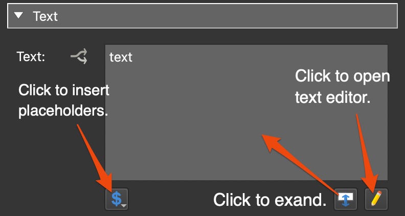
Click the pencil icon to open the rich text editor.
Color
Change the color of the text. ✭ Logic Block available.
Font
Deselect Default to customize the font’s size and weight. The default will use the system’s font. Simple HTML tags can be used in the text field (like bold, italics, etc.) For more control over fonts, you can use CSS.
-
Size – Change the font size.
-
Weight – Change the font weight.
Align
- Horizontal – Align the text horizontally: Left, Center, Right, Justify
- Vertical – Align the text vertically: Top, Center, Bottom
Formatting
-
Word Wrap – Select to wrap the text to the next line.
-
Auto Size – Select this to automatically size the box around the text. Position Anchor will be used to determine from which corner or the center the text should expand or shrink from when auto sized.
★ Tip To have a text box anchored top left and expand/shrink from its center, add the text box as a child to a container. Anchor the container top left and anchor the text box to the center of the container. -
Scroll Bar – Select to have a scroll bar added if not using Auto Size and the text extends beyond the rectangle bounds. If Auto Size is selected this setting is ignored. However, one could use Auto Size and Scroll Bar in conjunction with CSS that limits the size of the text field.
-
Enable trailing ellipses – If the content is too much for the text box, trailing ellipses (…) will be added to indicate there is more text. Unavailable when Word Wrap is selected.
Padding
Adds space between the text and rectangle border.
-
Top/Bottom – Set the amount of padding in pixels to the top and bottom of the Text Box.
-
Left/Right – Set the amount of padding in pixels to the left and right sides of the Text Box.
-
Link Values – Select to link the padding values.
Accessibility Notes
For tab index if the text box has Scrollbars selected it’s assumed that this is an information box with long texts that has no click actions. So that when a user tabs to it, the text can be scrolled with cursor keys.
A text box with no scrollbars, tabbing will activate click actions.
Position
ID
Give the element a unique ID or name. An ID is given automatically and will be numerically ordered when more than one are added. If an ID is already used by another element, a warning symbol will appear next to the input field.
Point Hotspot Templates will have a menu that shows all the default template IDs as well as any template IDs used in the project.
Position
The X and Y coordinates for the element.
An element’s position is relative to its parent and to its anchored position (the Canvas is the parent to top level elements).
For example, a video that is anchored and placed in the middle of the Canvas
will have its anchor set to center and X and Y set to 0. So, if the
element is anchored to the horizontal center, the X coordinate is measured from
the center of the parent to the horizontal center of the element. Likewise, if
an element is anchored right, the x-coordinate is measured from the right side
of the parent to the right side of the element as indicated by the arrows.
0. This makes it easier to precisely position elements, especially on the edges of the player. For example, to keep an element positioned on the bottom center of the player and a certain distance from the edge, set the anchor to center bottom and set the Y value to 20 pixels and X to 0.X and Y:
-
Percentage – Unit to set the position of the element based on the player’s size/window.
-
Pixels – Unit to set the actual location of the element within the skin.
-
CSS – Select CSS as a unit to allow for changing units when a logic block has been added or to use calculations.
- Example: Set the x position unit to CSS. Enter,
100pxin the edit field. Add a logic block, choose a trigger and add20%for the size, effectively switching units.
- Example: Set the x position unit to CSS. Enter,
Anchor
Use this grid to “stick” the element to a section of the player window. See above, to learn how the Anchor influences Position.
Size
The Hotspot Template and Node Marker do not have a size parameter.
Adjust the element’s size (width and height) in pixels. Width and Height:
-
Percentage – Unit to set the size of the element based on the player’s size/window.
-
Pixels – Unit to sets the actual size of the element.
-
Lock Aspect Ratio – Click the link icon to lock the element’s size aspect ratio when resizing in the Canvas or changing size values in the properties panel. This button is reset to off when another element is selected.
-
CSS – Select CSS as a unit to allow for changing units when a logic block has been added or to use calculations.
- Example: Position an element 50 pixels from the top and then set the height
to
calc(100% - 50px). The element will then always have the same distance of 50px from the top and will extend straight down to the bottom.
- Example: Position an element 50 pixels from the top and then set the height
to
-
Reset Size – Available for Image, Button, and SVG elements. Click to return to the image’s original size.
-
Reset Size/2 – Available for Image, Button, and SVG elements. Use this when you want to add a PNG or JPG to your project but still want it looking sharp in Hi-DPI displays. For example, if the skin requires a 32px image, use a 64px image and then click, Reset Size/2. This will then make it 32px in the skin but will still have all the pixels for a high resolution display.
Appearance
Scaling
Scales the element along the x and y axes. Doubling the value on either axis, for instance, will double the size of the element. If a scaling modifier is enabled, this scaling setting is ignored.
Center
Use this grid to determine how the element scales. The default is set to the center so the element will scale in or out from its center. If you anchor the scaling to the upper left corner, for example, the scaling will center from this point.
Angle
Use this parameter to adjust the angle of the element. It will use the Center grid (above) as its axis. For example, if the center is chosen, it will rotate around its center. If the bottom left corner is selected, the button will rotate around that corner.
Visible
Select or deselect to keep the element visible or invisible. Visibility or invisibility can be changed and toggled with actions.
Alpha
The transparency of the element. A setting of 1.000 is opaque. Lowering this number will increase the elements’s transparency.
Cursor
Choose which cursor shows when the mouse rolls over the element.
Inherit – The element will inherit the cursor from its parent element. This is the default for all elements except Button and Seekbar.
Hand – The hand cursor will show. This is the deafult for Button and Seekbar elements. When selected, the cursor is not inherited from its parent element.
Default – Choose this option to force the browser’s default cursor (usually an arrow). When selected, the cursor is not inherited from its parent element.
Masking
Container and Rectangle elements only Select Enabled to activate masking. Masking means that child elements of the container or rectangle will be clipped at the container or rectangle’s boundaries.
Accessibility
Tab Index
To make skin elements controllable via keyboard, they have to be added to the
tab order of the web page. A tab index of -1 (the default) excludes the
element from the tab order. A tab index of 0 includes the element in the tab
order. Browsers will highlight the active element by putting a rectangle around
them. Once a skin element is the active element, indicated by the highlight, hit
the Enter/Return key to trigger its click action.
ARIA Label, Description, Details
These are attributes or propterties that are used to define the element and support the Role.
Label – Defines or names the element.
Description – Provide a brief description of the element.
Details – Provide an extended, detailed description of the element.
ARIA Roles
ARIA Roles are used to define UI elements (button, loading bar, etc.). Choose from the list which best defines the element.
Hidden
Select to hide all ARIA attributes.
Advanced
Z-Index
Set the CSS z-index property. Use numbers to set the stacking order or leave the setting at Default. Default will use the stacking order set in the Tree.
This is used to ensure that elements are displayed in the correct stacking order especially when close or overlapping.
Permeable
Select to make sure the element does not accept mouse clicks. This is useful for when you want to include an element in the skin but don’t want it to hinder the ability to interact with the panorama. For example, you could add a vignette or logo or border that when clicked on, will allow interaction with the panoramas.
Hotspot Proxy ID
Enter the corresponding ID. The ID
comes from the hotspot’s ID field in the hotspot properties. Hotspot proxies
give you the ability to link skin elements to specific hotspots. This means that
the element will receive the same mouse and touch events as the hotspot (mouse
click, mouse double-click, mouse enter, and mouse leave). You can also add {}
to use node ID as hotspot proxies.
Learn more.
CSS Classes
Enter the CSS class names for the selected element. You can enter more than one
class separated by spaces. If you need more space, click the Edit button to
the right of the field for a larger text field. No dot . needed.
CSS Styles
Enter the CSS style attributes for the selected element. You can enter more than one style separated by semi-colons. If you need more space, click the Edit button to the right of the field for a larger text field.
CSS Styles Inner Element
Enter CSS style attributes for the selected element’s inner element. (Some skin
elements, like Image, Video and External Image, have an inner element nested
inside the element’s main <div>.)
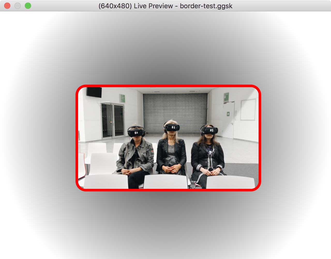
For example, an image element can have a border:
border-radius: 20px; border: 5px solid red;. This can also be entered with a
line break: border-radius: 20px; border: 5px solid red;
Keyboard Shortcut
Enter the preferred key to control the action defined to the element. For example, select the text field, hit the up key on the keyboard. Then add a Mouse Click action. The element, when clicked or when the up key is pressed, will perform the assigned action.
Exclude from Translation
Select this option to not include this element in the skin’s translation file.
Safe Area
Available for the Container Element.
Select Use Safe Area for Position and Size to keep child elements of the container inside the safe area of the device. This option makes sure that the elements are always 100% visible and the skin will automatically react to the device’s safe area.
Make sure Ignore Safe Area is not select in the HTML template settings in the Web Output.
Actions
Actions or a set of directions can be applied to any element added to the skin to create interactivity.
Double-click in the Actions area or click the plus sign to the right to open the Action Settings.
See Skin Actions, for details on all actions.
Modifiers
Adding modifiers allows you to make elements move, scale or rotate when the panorama is being panned, tilted, zoomed or loaded. A good example of a use of a modifier is for a loading bar that scales in relation to how much of the panorama has been loaded.
Double-click in the Modifiers area or hit the plus sign to the right to open the Modifier Settings.
See Skin Modifiers, for more details on all modifiers.
Notes
Use this section to add information about the element. This is especially useful if you have a component and want to explain the elements inside that component.
Notes will show up as tooltips in the Tree.