Web Output Properties
The Web Output Properties open in the Properties panel. This is where you set player-based parameters such as the context menu, HTML file, and multiresolution settings.
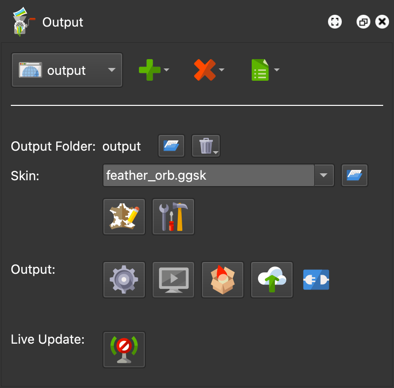
When the Web output is selected from the list of formats, the following settings will be visible. More properties for the web output will open in the properties panel.
Output Panel
Output Folder
All files associated with this output will be added to this folder unless
otherwise specified. Its default name is output. Its default location is the
same folder as the source image.
-
You can change the output folder’s location by clicking the folder icon and navigating to the new location.
-
Right-click the folder name to change its name or to find the folder’s location in Finder [macos] or Explorer [win].
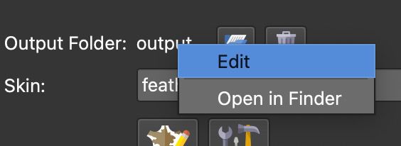
Output Folder name context menu -
Each output will create a unique folder name to avoid overwriting previous outputs.
-
Erase Output Folder – Click the trashcan icon to erase all the content from the current output folder. Long press the button to choose to erase all the content except for the outputted tiles.
Skin
Here you can choose either one of the pre-installed skins or choose one that
you have created in the Skin Editor.
All skins saved to the
default Skins folder will be
listed in the menu. Otherwise, use the Open Skin button to add a skin or drag
a skin file to the menu. If a skin is found in the same location as the source
image, it will also be visible in the list preceded with $d: $d/myskin.ggsk
Right-click the skin file to locate it in Finder or Explorer.
The file extension used for skins is .ggsk (stands for Garden Gnome
Skin).
Open Skin – Click this folder icon to navigate to a skin and add it to the output.
Edit Skin – Click this button to open the currently selected skin in the Skin Editor.
Edit Skin Configuration – Click to edit the initial values of exposed variables of the skin. This lets you configure skins to the needs of the current project.
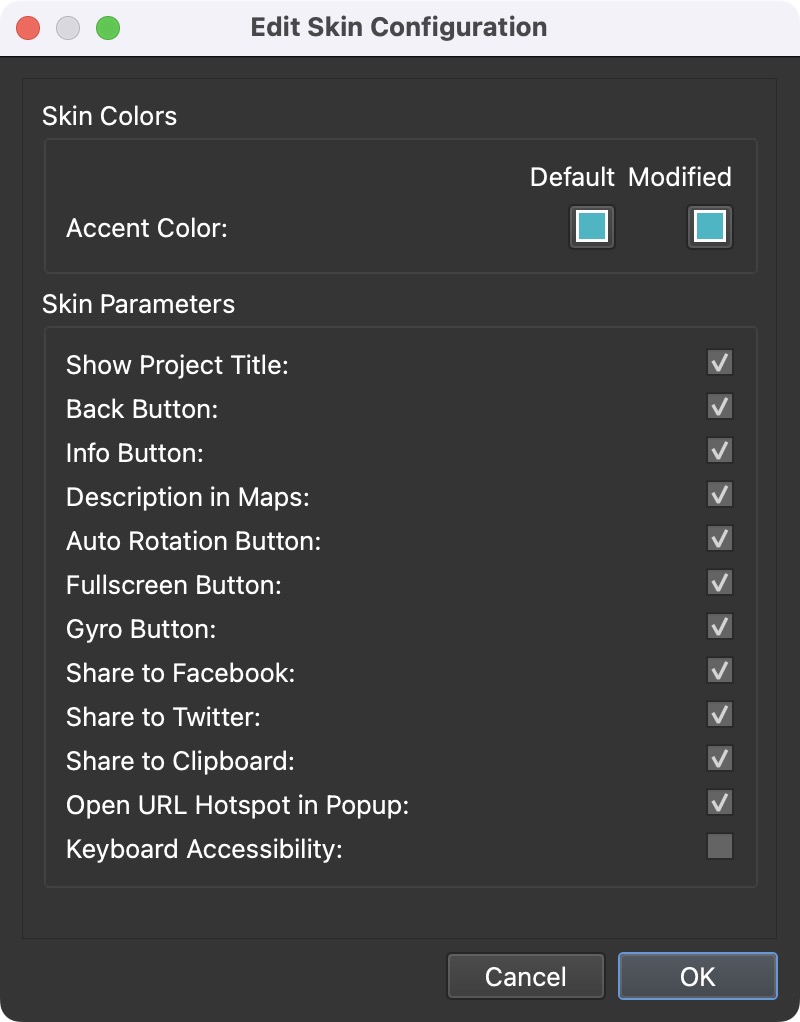
For example, if you have a skin that is frequently applied to projects but a certain element or component (like the Fullscreen button) is not always needed, a variable can be applied to that element’s Visible Logic Block. Then, you can change the variable’s value via the Skin Configuration.
Output
Generate Output – This button will generate the output. Keyboard shortcut: Command-Option-G [macos] or Control-Alt-G [win]. Alt-click [win] or Option-click [macos] to generate all outputs.
Open Output – Click this button to view the output (output must be created first) using the Integrated Web Server.
Generate Garden Gnome Package – Clicking this button will output the Garden Gnome Package format that is used for embedding panoramas in a CMS website.
Upload – Upload the project to Gnome Cloud.
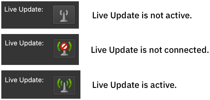
Connection Status – The icon next to the Upload button indicates whether or not the project has been uploaded to Gnome Cloud and it is connected to the current project. Right-click this button to:
- Disconnect from Gnome Cloud – Disconnect the currect project from the uploaded version on Gnome Cloud.
- Select Gnome Cloud Account – Choose this option to switch to Gnome Cloud account that this output is connected to.
Live Update
Toggle Live Update on or off.
When a web output is exported, the output is automatically opened in the default browser. After saving, the project is updated live in the browser when Live Update is activated. This keeps you from having to manually export the project to see changes. Live Update will also update with every change in the skin.
To keep Live Update on, but stop it from always updating when creating a skin, select Live Update on Save Only from the View menu in the Skin Editor.
Properties Panel
The following settings are found in the properties panel.
Autorotation & Animation
Fly In
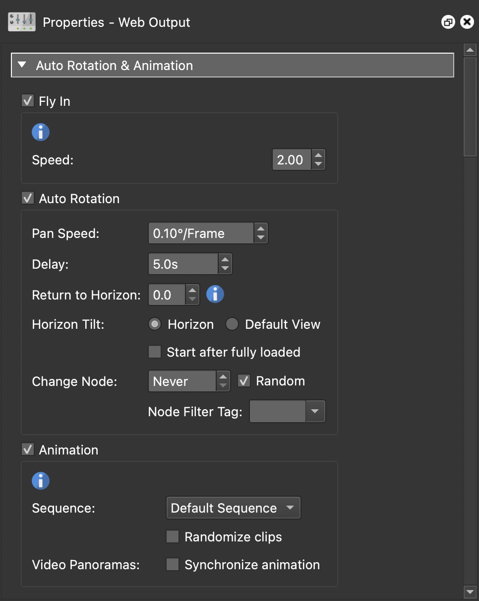
A fly in is a dramatic opening of a project that usually begins with a little planet and ends with a rectilinear projection. You can design the fly in the Viewing Parameters.
Select, Fly In to enable the feature.
Speed – Determine the speed of the transition.
Autorotation
If you want the panorama to automatically rotate, select Auto Rotation to enable the feature.
Pan Speed – Pan speed refers to how fast the panorama will rotate from left to right (positive number) or right to left (negative number) (degrees per frame).
Delay – The time it takes for the panorama to begin to rotate again (in seconds) after it has been manually moved by the user.
Return to Horizon – Brings the panorama’s center perspective (horizon) back into view after it has been manually moved upwards or downwards. A value of 0 will equate to no return, and an increase in the value will return the image to the horizon at a quicker speed.
Horizon Tilt – Choose how the image returns to auto rotoation.
- Horizon – Choose horizon to have the image return to a tilt value of zero
- Default View – Select to use the tilt specificed in the Default View.
- Start after fully loaded – Select to have autorotation begin only after the panorama has been fully loaded. If left disabled, the panorama will rotate while it is being downloaded.
Change Node – Select this option to automatically change the nodes in a tour, every n seconds. The panoramas will change according to their order in the Tour Browser, which you can change to suit the tour’s story or flow.
- Random – Select to randomly change the nodes.
✭ On a computer, the mouse cursor will hide after 3 seconds of inactivity
- Node Filter Tag – Here you can filter which nodes should be included in the autorotation by selecting a tag that has been added to nodes.
Animation
Animation – Select this to use the custom movement you’ve created in the Animation Editor instead of autorotation.
Sequence – Select a sequence to use for the autorotation. Choose Randomize Clips – Select to have the clips in the sequence played back randomly.
Video Panoramas – Select, Synchronize animation, if you’ve added an animation to a video panorama. This will sync the animation you created in the Animation Editor with the video. This means that whenever the animation begins in the player, it will run in sync with the video panorama.
Transitions
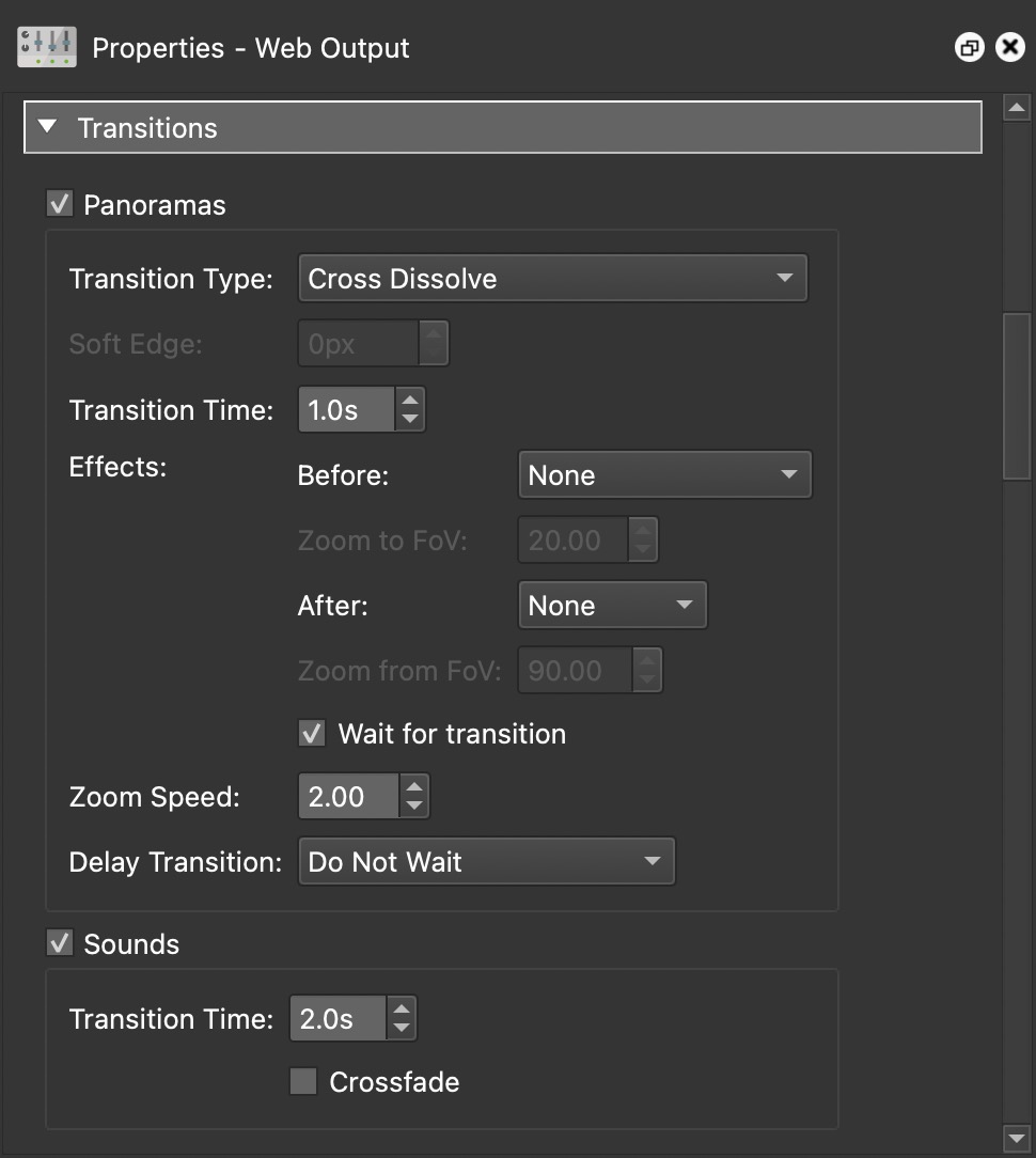
When building a tour, you can add transitions to your project to create smooth changes from one image to the next. You can choose to transition between panoramas or the sound or both.
✭ Learn how to add transitions to your tour.
Panoramas
Select to enable transitions.
Transition Type – Choose the type of transition:
- Morph – A special transition that blends the panoramas in a way that suggests movement between the panoramas.
- Cut
- Cross Dissolve (default)
- Dip to Color – Use the color picker to the right to choose a color.
- Iris Round from Click Position
- Iris Round from Center
- Iris Rectangular from Click Position
- Iris Rectangular from Center
- Wipe Left to Right
- Wipe Right to Left
- Wipe Top to Bottom
- Wipe Bottom to Top
- Wipe Randomly
Soft Edge – Most transition types can have a soft edge. It defines how much the edge of the transition is blurred. Use a low value of around 30 pixels for a subtle motion blur-like effect, or a high value of around 300 pixels for a very blurry transition.
Transition Time – The time of the transition from one panorama to the next, not including the Before and After effects. The default is 1 second.
Effects – Choose to have effects occur before and/or after the transition.
Before
- None – No transition effect will be applied before changing the node.
- Zoom In – Will zoom in to the direction of the hotspot.
- Zoom In to Pan – Zooms in toward the Pan angle only. This is useful for hotspots placed on floors as it prevents zooming to the floor.
- Zoom in to Center – Will zoom towards the center of the panorama.
Zoom to FoV – Set how far to zoom in before the transition occurs. If the default Field of View is to 70º and Zoom In is set to 20º, then the player will zoom in to 50º before transitioning.
After
- None – No transition effect will be applied after the node changes.
- Zoom In – Will zoom in in the direction of the hotspot.
- Zoom Out – Will zoom out from the location of the hotspot.
- Fly In – Fly in from a spherical (little planet) to a rectilinear projection.
Zoom from FoV – Set how far to zoom out the transition occurs. If the default Field of View is to 70º and Zoom Out is set to 20º, then the player will zoom out from 50º before transitioning.
Wait for transition – When selected, the After transition effect, will not occur until the transition is finished. When deselected, the effect will occur at the same time as the transition.
Zoom Speed – The speed of the zoom effect.
Delay Transition – Select a delay option. The delay is helpful if the tour is slow to load. The default is to transition immediately, but if the connection is slow or the next node is a 360 video, it could result in black tiles. Choose from the following options:
- Do Not Wait – The default setting.
- Wait for Preview Track – The preview track will load before the transition.
- Wait for Video Panorama – If a video panorama is the next node, the transition will occur once the video is loaded.
Sounds
Select to enable transitions for sounds.
Transition Time – The full time of the transition of sounds from one panorama to the next. The default is 2 seconds.
- Crossfade – Select to use a crossfade between the sounds of the two nodes. If this is not selected, the sound of node 1 will completely fade out, and then the sound of node 2 will start fading in. If selected, the sound of node 2 will immediately start fading in, while the sound of node 1 is fading out. ✭ Currently does not work in Safari.
Hotspots
Hotspot Textbox
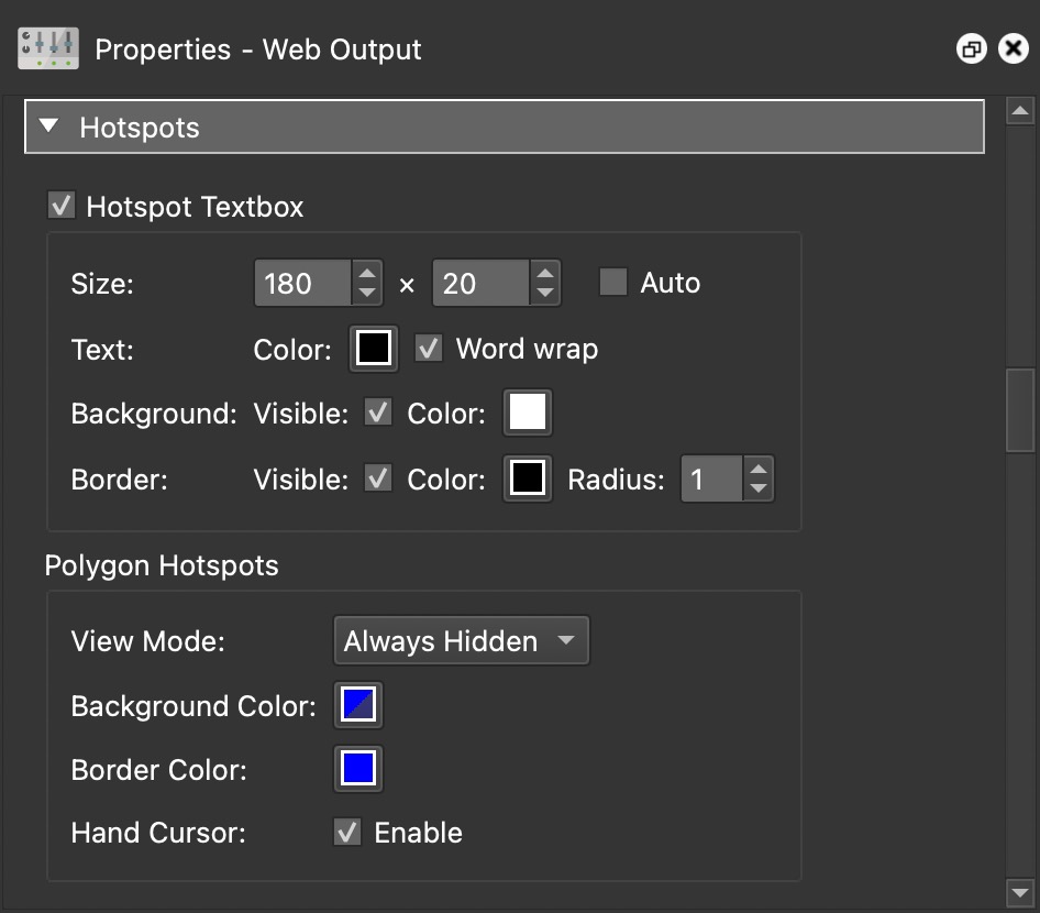
A hotspot text box appears when a mouse hovers over a hotspot (tooltip). Select to activate its settings below.
Size – Set the size of the text box for the hotspot.
- Auto – Choose this to have the text automatically fitted within the text box.
Text – Set the text settings.
-
Color – Select the color of the text by clicking on the color well. The default is black.
-
Word Wrap – When selected the text will wrap to the next line.
Background – Set the text box’s background color.
-
Visible – Select to show the background of the text box. When not selected, no background will be seen.
-
Color – Click to choose the color of the background.
Border – Set the text box’s border.
-
Visible – Select to show the box’s border. When not selected, no border will be seen.
-
Color – Click to choose the color of the border.
-
Radius – The radius (roundness) of the box’s border. Increase the number for a round rectangle or eventually a circle.
Polygon Hotspots
If you’ve added polygon hotspots, then these settings will affect how they appear in this web output.
View Mode – Choose how the hotspot appears on screen:
-
Always Hidden – The hotspots will be active but not highlighted.
-
Always Visible – The hotspots will always be active and visible (see background and border colors).
-
Show Current – The hotspot will only be visible when the mouse enters the active area.
-
Show All – All polygon hotspots will be visible when the mouse enters the active area of one of the hotspots.
-
Disabled – The polygon hotspots will not be visible nor active.
Background Color – Choose the fill color of the hotspot.
Border Color – Choose the border color.
Hand Cursor – Select to enable the hand cursor with the mouse hovers over the polygon hotspot.
VR
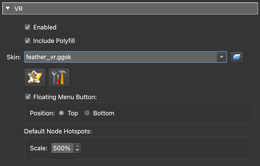
Select Enabled to include WebXR support on output. This will add folders and files to the output folder that are needed to display the VR output in the browser.
Include Polyfill – Option removed in version 7.1.6. The WebXR polyfill allows for WebXR support on mobile devices; or Cardboard support. Unfortunately, this polyfill is no longer maintained and certain features may not work properly on certain devices, namely iOS devices. Deselect this to prevent WebXR on mobile phones and limit VR to headsets.
Skin – Select a skin for VR. Pano2VR ships with built-in skins that are free to use and edit for your needs. Each skin has a menu to navigate to nodes. The menu appears when the head tilts up. Not all elements are supported in VR.
Floating Skin Menu Button – Selected by default. Deselect to hide this menu button that appears when viewing up in the VR output. This menu button toggles the VR skin on and off.
- Position – Choose where the Floating Skin Menu button should appear. At the Top (looking up) or at the Bottom (looking down).
✭ Use the Grip button on Quest to show and hide the skin.
Default Node Hotspots – The default images for node hotspots are 3D spinning globes. They will be used by default if no skin is used or no point hotspot template is used for tour node type hotspots.
- Scale – Scale the spinning globes to make them larger or smaller; the default is set to 100%.
HTML
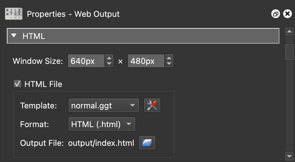
Create a customizable HTML template.
Window Size – Adjust the width and height of the player window. Window size also plays a role in determining optimal cube face size in a single resolution output. It will also set the preview image size when using Files for external embedding (found in the HTML template settings).
HTML File – Select this option to enable and access the HTML template parameters.
Template
Choose a template and then click the Edit Template button to open the template settings.
Format – Choose the file format. .html or .htm
Output File – The output file name. Click the folder icon to the file’s location. By default, the HTML file is added to the output folder. By default, the HTML file is added to the output folder (that is set in the Output panel).
Control
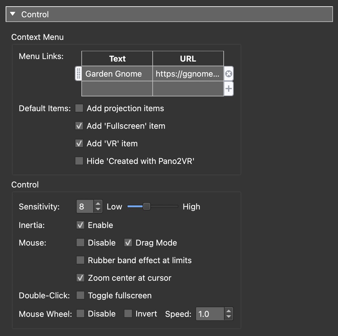
Context Menu
The context menu is the menu that pops up when you right-click in the image.
Menu Links – Here you can add links as menu items. Double-click in table or click the plus symbol to add the first item. In the top row, add the text that should be linked. Click the plus to add more, click the x to delete, grab the handle on the left to rearrange.
Add Projection items – Select to add options for switching the projection in the player.
Add ‘Fullscreen’ item – Select to add a menu option to go into Fullscreen mode.
Add ‘VR’ item – When selected, an Enter VR item will appear in the context menu. It will detect when a wired headset is connected to the computer.
Hide ‘Created with Pano2VR’ – Select to hide ‘Created with Pano2VR’ from the context menu.
✭ Learn how to add a logo to the context menu.
Control
Sensitivity – Set the panorama’s sensitivity to the movement of the mouse. A low sensitivity will cause it to move slowly with the mouse’s movement.
Inertia – When this is enabled, the panorama will slowly come to a stop – as if it has mass. If not enabled, it will stop immediately.
Mouse – Mouse controls.
-
Disable – Select to disable mouse interactivity.
-
Drag Mode – Select this (selected by default) to invert the mouse control. When inverted, rotation will be in the same direction as the mouse.
-
Rubber band effect at limits – Select this to enable the rubber band effect so that the panorama can be dragged or pulled beyond its viewing limits. Once the mouse or finger releases, the panorama will bounce back to its original viewing limits.
-
Zoom center at cursor – Select to zoom at the mouse’s location. Deselect to have zoom happen at the center of the viewport. Below is a gigapixel panorama and the project is set to use Zoom center at cursor. Move your mouse to the clock and zoom in. On a touch device, the center of the zoom will be at the touch location’s center.
Loading…
Double-click – Fullscreen option.
- Toggle Fullscreen – Selects the fullscreen mode on double-click or double-tap when using a touch screen device. With this option, a skin is not required to enter and exit Fullscreen mode.
Mouse Wheel – Mouse wheel controls.
-
Disable – Disable interactivity of the mouse wheel.
-
Invert – Invert the interactivity of the mouse wheel. For instance, scrolling down will zoom out (instead of zooming in).
-
Speed – The rate at which the panorama will move relative to the mouse wheel.
Keyboard
- Disable – Select to disable input from the keyboard
Image
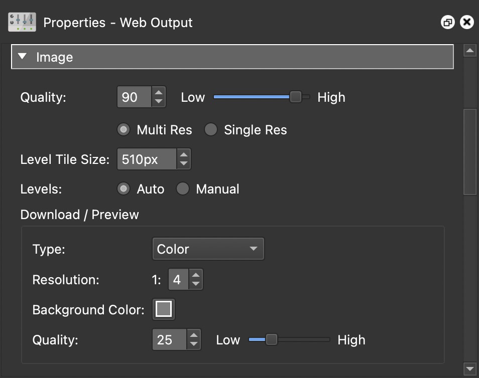
Quality – The overall quality of the image as defined in JPEG images. 90% is the default value, lowering the value below 90 will decrease the quality of the outputted images.

Multi Res
Select to output multiple resolutions of the panorama. This will allow users to see a sharper image when they zoom in – it keeps the image sharp at all zoom levels. When this is selected you’ll see the following settings:
Level Tile Size – This determines the size of the sub tiles in pixels.
Filename – This determines the file location and naming convention of the generated sub tiles. You may change the name to suit your project although the multiresolution placeholders must be used so Pano2VR knows which tiles to use.
Levels – Set the levels of resolution either automatically (Auto) or manually (Manual).
When Auto is chosen, levels will be automatically set. The levels are based on the calculation chosen in the program’s settings (Settings > Advanced > Output > Use width/Pi as output factor).
When Manual is chosen, you can enter the level size yourself. In the table that appears, double-click in the empty field and the first level will be added. You can change this value (which is the result of image width/4) or keep it. Click the plus sign or double-click the field below to add another level. It’s recommended to have the last level be equal to or just a bit less than the Level Tile Size.
Single Res
Select to output a single resolution.
If this is selected you’ll see the following settings:
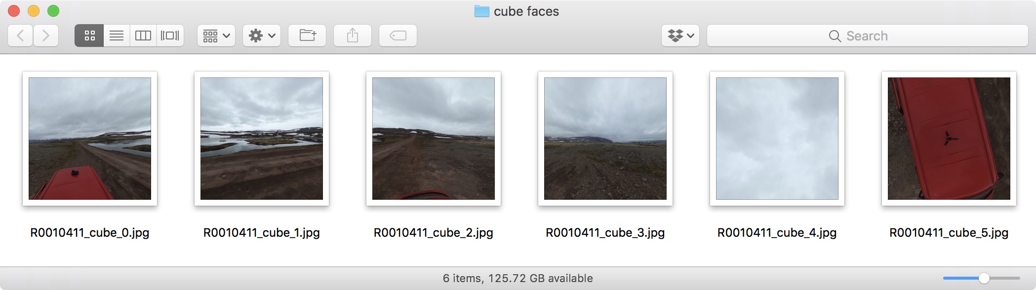
Cube Face Size – The size of a cube face, measured in pixels (height x width). Pano2VR will calculate the best output cube face size based on the original image and the window size. However, you can always change this value to what you like.
Tile Quality – Here you can set the image quality of the individual cube faces plus the preview image. For example, the zenith and nadir images could be lowered further if their information is not critical.
Interlacing – Select this option to use progressive JPEGs.
Image Names – This creates a folder to hold the cube face images. Or you
can choose your own folder or location by clicking, Open…. The default is
images/$n_o.jpg. $n is a
placeholder that will be replaced by
the image’s name. o simply stands for output and can be removed or changed
according to your needs.
Face Names – Choose a naming convention for the cube faces. The naming convention will be appended to the file name displayed in the Image Names text field.
Download/Preview
This section will determine how the preview image of the panorama will look. This is what the user sees as the tiles are downloading.
Type – Choose the type of download preview image: Grayscale, Color, Sepia, or Gaussian Blur. When None is chosen, no preview image is used during download. Rather, only a background color is shown (color-picker).
Resolution – This represents how sharp or blurry the download preview image will appear. This setting will effect the file size. The default setting is 1:4 which is a reasonably good setting. Setting it to 1:1 makes the preview image as clear as the original image.
Background Color – Click the color picker to choose the color of the background.
Quality – The quality of the preview image as defined in JPEG images. 25 is the default value.
Advanced
Skin
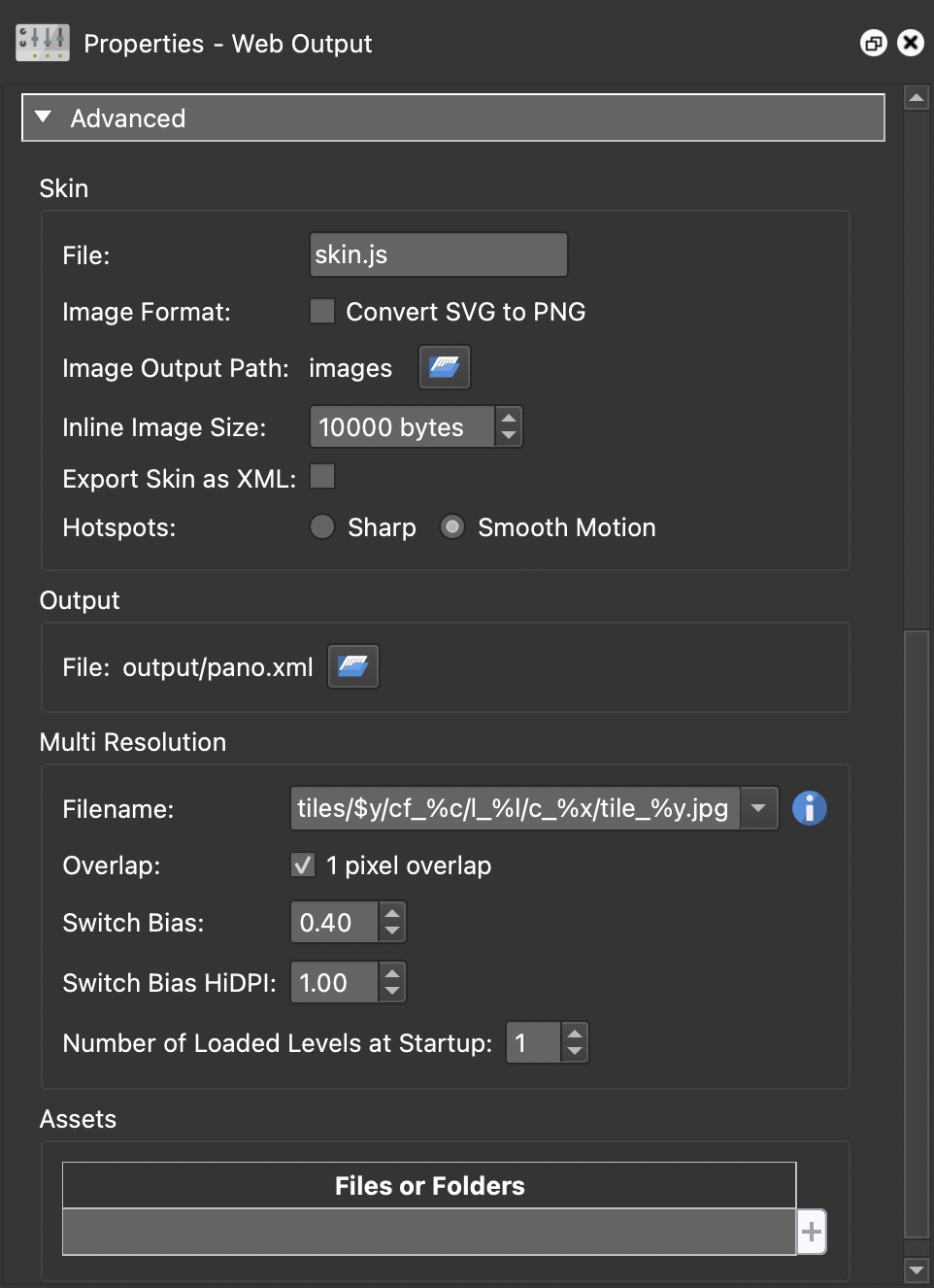
File – Rename the Skin file here. This is useful if you want to have multiple versions of a project with different skins share the same output path. This way, you can have multiple skins in the output folder.Image Format – Select Convert SVG to PNG to have the SVGs in the skin converted to PNG. If this is not selected, Pano2VR will output both formats.
Image Output Path – This creates a folder to contain the images of the skin and by default is placed in the same location as the panorama. The default is the same folder (images) that holds the cube face images. The name of this folder can be changed. Clicking Open… will let you choose a specific location.
Inline Image Size – Set the size limit of inline images (images that are
stored within the skin and not as files in the image folder). Setting this limit
to 0 will place all images in the images folder.
Export Skin as XML – Select to export the skin as an XML file to the output folder (This is needed by some 3rd party VR players).
Hotspots – Choose how the hotspot images are rendered on output. Sharp will sharpen the images, but they may have a choppy movement. Smooth Motion slightly softens the hotspot but it will have a smooth movement in the skin.
Output
File – This is the output file path. You can change its location and name of the file by clicking the folder icon to the right.
Multiresolution
This setting is available when Multi Res is chosen in the Image settings.
Multiresolution allows you to break an image down into multiple levels (or layers) so that every zoom level has good resolution. This section is only available if Multires in the Image properties is selected. Filename – Here, you can choose the naming convention of the tiles. The naming convention is created with placeholders and you can choose from the list or build your own.
Overlap – Keep selected to have the tiles overlap by one pixel to avoid visible seams in the image. If using tiles from a source other than Pano2VR, this option may need to be deselected for correct tile alignment.
Switch Bias – Changing this setting will determine at which zoom levels the tiles will change. The higher the number, the sooner the tiles will change. If this is set too high it will require much more processing (downloading and decoding) for the host computer. A good compromise setting is between 0.4 and 0.5.
This all works by comparing screen and image pixels:
-
Bias = -1 – A negative setting will change the tiles when there are 4 image pixels to 1 screen pixel. Zooming in will cause the visible tiles to change just before there are 4 image pixels to 1 screen pixel. Zooming out, the tile will change just before there are 2 image pixels to 1 screen pixel.
-
Bias = 1 – A high bias number will change the tiles sooner and will produce aliasing, and will increase processing load. Zooming in will cause the visible tiles to change just before there is 1 image pixel to 1 screen pixel. Zooming out will change the tiles just before there is 0.5 image pixel to 1 screen pixel.
-
Bias = 0 – Zooming in will cause the visible tiles to change just before there is 1 image pixel to 2 screen pixels. Zooming out will change the tiles just before there is 1 image pixel to 1 screen pixel.
Switch HiDPI Bias – This setting is similar to Switch Bias except it is for high resolution displays and ensures better viewing of high resolution images.
Number of Loaded Levels at Startup – Set the number of levels that will be loaded when the player is first opened.
Assets
Add external media to the project. On output, Pano2VR will copy the media from the media’s locations to an Assets folder within the Output folder. Folders will be added as subfolders to the Assets folder.
Double-click in the table or click the plus to the right to navigate to a file or folder to add the file path. Alternatively, drag files or folders to the Assets table.