Skin Elements
A skin element is any object added to the skin.
Elements like Text Boxes and Timers are added by selecting them in the Toolbar and then clicking in the Canvas. Elements like Images or Sounds can be dragged onto the Canvas.
When an element is selected, its properties appear in the Properties section of the Skin Editor.
There are properties that all elements share; like, Actions, Position and Appearance. But they will also have their specific properties.
When multiple elements are selected, for example, a text box, rectangle, and container, you will see their common settings in the preferences. You can then change the size, for example, for all of them at the same time.
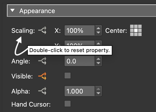
Some element properties like Position and Scaling can have their settings reset by double-clicking on their labels. The cursor will change to a hand, indicating that it’s clickable. Position, for example, when double-clicked will be reset to 0,0.
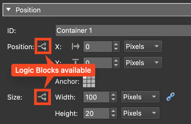
Many parameters have
logic blocks and are
indicated by the logic block icon.
Formats
File formats that are supported in the skin:
| Format | HTML5/Web | Notes |
|---|---|---|
| PNG (24) | Yes | |
| PNG (Animated) | Yes | External Image Loader |
| GIF | Yes | |
| GIF (Animated) | Yes | External Image Loader |
| JPEG | Yes | |
| WEBP | Yes | |
| SVG | Yes | |
| SVG (animated) | Yes | |
| SWF | No | |
| MP4 | Yes | |
| WEBM | Yes | |
| MP3 | Yes | |
| Yes | PDF element |
★ No media can auto start; but muted video can auto start.