Custom Hotspot Images
Each hotspot can have its own image. The custom hotspot image can be added in the skin to affect all hotspots using hotspot templates. Or you can add a custom image to individual hotspots.
Add an individual custom hotspot image
If your tour is small or you just need to apply a different image to a hotspot, you can add a custom hotspot image without editing or applying a skin.-
Add a point hotspot.
-
Choose a hotspot type.
-
Choose an image for Custom Image by clicking the folder icon. Once the image is selected you can choose to have the image 3D distorted so that it distorts with the panorama. Or if you don’t choose 3D distorted, you can change the image’s size.
Add custom images to hotspots globally
Pano2VR
uses default Skin-IDs to connect point hotspots to hotspot templates. For
example, a URL type point hotspot will be assigned the Skin-ID, ht_url by
default and connects to the
hotspot template that has the
ID, ht_url.
Alternatively, you can use a built-in hotspot component and swap out the icon.
1. Add the custom image
-
Open the Skin Editor.
-
Click, Add hotspot template in the Toolbar and click in the Canvas to add a hotspot template.

Point Hotspot Template This template acts as a placeholder and affects only point hotspots. The crosshair image will not be visible in the skin. You can place the template anywhere, as its placement in the skin is arbitrary.
-
Add the hotspot image or icon. Use the Add Image button or Add SVG button.
This can be a JPEG, PNG, GIF, APNG, SVG, Animated SVG, or WebP.
Resize it if needed.
-
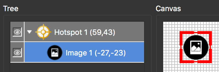
In the Tree, drag the image on top of the hotspot template. When you do this the image will become a child of the template.
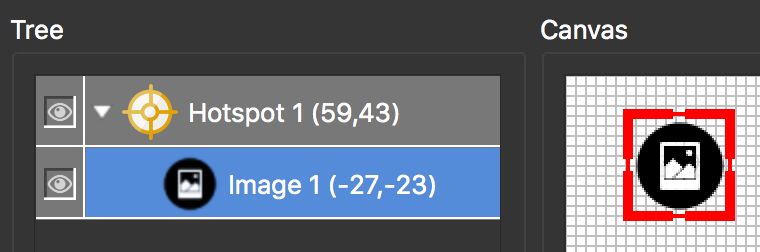
Image is a child of the hotspot template. -
Position the image by choosing Center for the Anchor and then double-click on the word, Position. This will center the icon directly over the hotpot template.
-
In the Appearance panel, select Hand Cursor. (optional) This will change the mouse cursor to a hand, indicating the icon is clickable.

2. Add actions for interactivity
Add actions to the hotspot template to have it open a webpage.
-
Select the image and go to its Actions panel. Add the following action for opening a webpage:
- Source =
Mouse Click - Action =
Go To URL - URL =
$(hu)(This placeholder will call up the information added to the Link Target URL in the hotspot properties.) - Target =
$(ht)(This placeholder will call up the information added to the Target field in the hotspot properties.)
- Source =
-
Give the hotspot template the ID,
ht_url, for example. This is the default Skin-ID for URL type point hotspots and will be applied by default to all URL point hotspots. Alternatively, give the hotspot template any ID and make sure to choose this from list of Skin-IDs for the point hotspot. -
Save the skin.
3. Connect the Hotspots to the Skin
The final step is to make sure the hotspots are linked to the Hotspot Templates in the skin. This is so that the hotspots inherit the icon/image and actions added to the hotspot template.
-
Add the skin to the project by selecting it in the Output properties.
-
In, the Viewer, select a hotspot to open its properties.
-
Choose URL as the hotspot type.
-
For the Skin-ID,
ht_urlis added by default. If you used a different ID, select it from the menu. -
Output the project.