Creating and Using Components
Components are a group of skin elements that are saved as a single element in the Components Toolbox and can be reused.
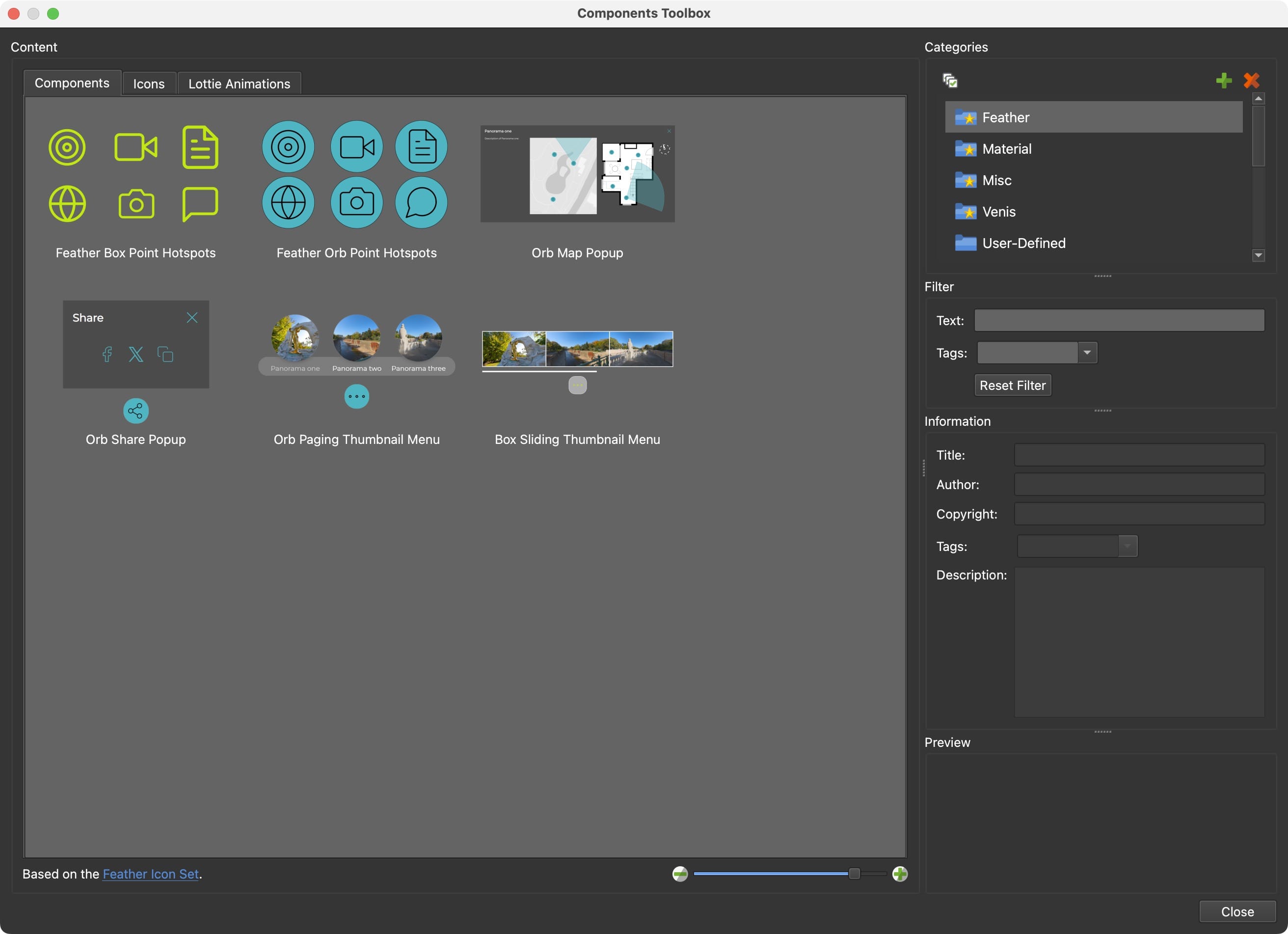
Understanding the Components Toolbox
The Components Toolbox is a feature in Pano2VR that allows you to store skin elements for reuse or sharing across different projects. It comes with built-in components that are free to use.
- Accessing Built-in Components: Open the Toolbox from the Toolbar or from Tools > Components Toolbox.
- Component Information: Click on a component to see details, such as a description, tags, and a preview image.
- The built-in categories are organized in Categories, while the components you create can be added to the User Defined category, or to a new category you create.
- Components Toolbox Interface
Adding Components to a Skin
To add a component:
- Double-click or drag the component into the canvas.
- Alternatively, use the context menu. Right-click and choose Add Component to Skin.
Example:
- Open a new skin.
- Add the Feather Box Point Hotspots component. This provides all the buttons and actions needed for all the point hotspot types. They will be arranged in a seemingly odd order. But because the hotspot template’s location in the skin arbitrary, there’s no need to rearrange them.
- Change the button’s background color to all buttons using the Color Tool. Make sure no element is selected and then open the Color Tool. Find the blue color and double-click the color in the right column to open the color picker to change the color.
- Save the skin and add it to your project. You now have a button set for all your hotspots.
Searching and Filtering Components
The Components Toolbox allows you to search and filter components by text or tags.
- Filter by Tags: Search using specific keywords (e.g., “feather”).
- Combine Filters: Narrow results by combining tags and text searches.
Example:
- Select all the Built-in Categories. Shift-click the last built-in category to select all the in list.
- In the Text Filter, type
menu. A number of menus should appear. - Now refine the search using Tags. Find the tag,
Categoriesand hit enter to filter. Now you should have menus that support categories/submenus.
Creating and Saving Custom Components
- Right-click the desired element in the tree or a group of components and select Create Component from Selection.
- Add it to an existing category or create a new one.
- Provide a title, or replace an existing component.
- Click, OK, to add it to the Components Toolbox.
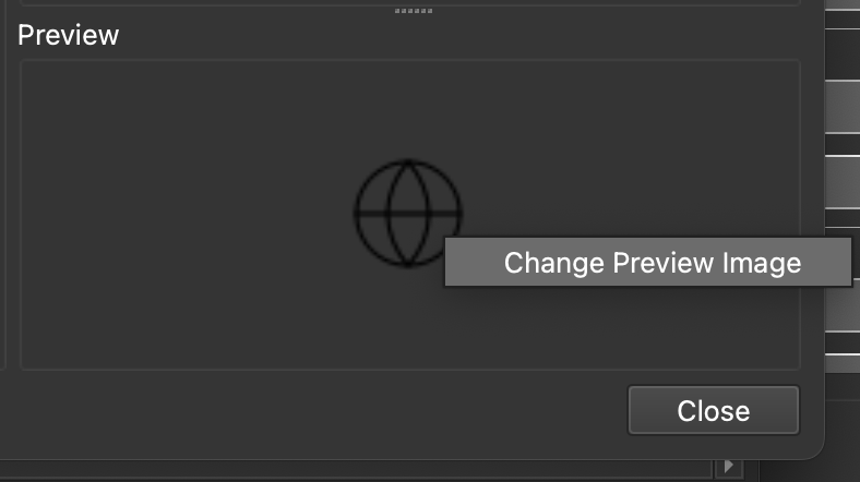
When the component is saved, it’ll take a screenshot of the skin’s Canvas or element for the preview image. You can change this preview image by right-clicking in the Preview and choosing Change Preview Image. Then navigate to the new image to set the preview image.
Sharing Components
Sharing components with collaborators or the community:
Exporting:
- Right-click a category in the toolbox.
- Select Open Category Folder in Finder (macOS) or Explorer (Windows).
- Share the component file. The file uses the extension,
ggskclikemap_popup_feather.ggskc. It’s a package file and can be shared to any other Pano2VR or Object2VR user.
Importing: Recipients double-click the GGSKC file to add it to their Components toolbox.