Components Toolbox
The Components Toolbox holds a collection of predefined skin elements including icons and Lottie animations.
Components are a group of skin elements that can be saved as a single element in the Components Toolbox. If, for instance, you have a button (or group of buttons) that you know you can use with multiple projects/skins, you can save the group to the toolbox. This makes it easier than saving different skin versions because you can categorize and tag them and even add descriptions.
Open the Toolbox from the Toolbar or from Tools > Components Toolbox.
Components Toolbox Interface
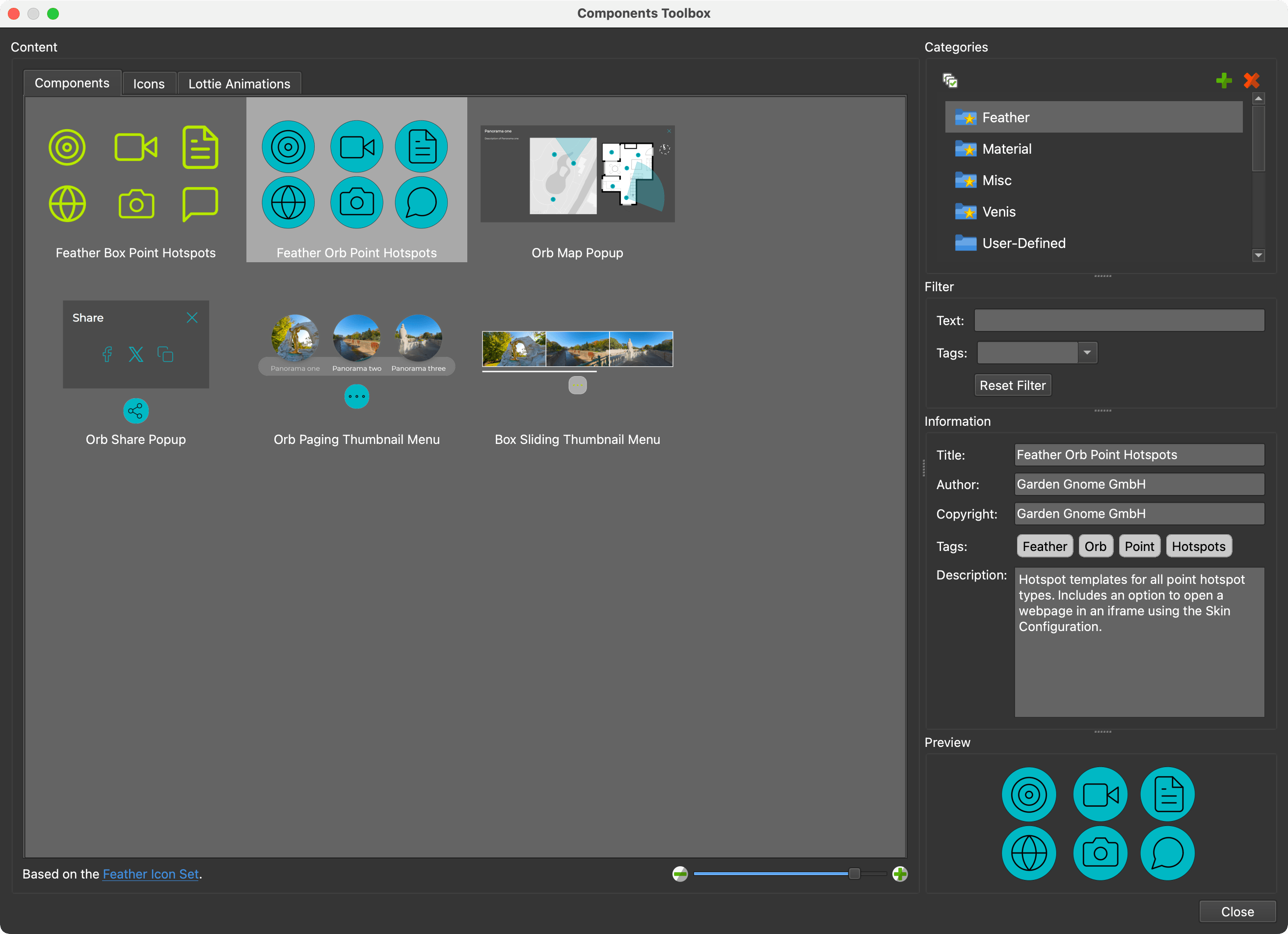
The Toolbox is sectioned into the following parts.
Content
The Toolbox holds components, icons, and Lottie files. Each has its own tab.
Use the thumbnail slider in the lower right corner to change the thumbnail size of the grid. Click on a component, icon, or animation to select it and have its information shown in the sections to the right.
Remove a component, icon, or Lottie file by selecting it and hitting the Delete key.
PNG, GIF, animated PNGs, and WebP formats are supported and will be added to the Icons tab.
Drag icons and animations to their respective tabs to add them to the toolbox or
to other categories. Icons that have multiple states can be
treated as a single icon. Use the file suffixes, _o or _over for mouse over
states and _a or _active for the active state:
my_icon_o.svgormy_icon_overmy_icon_a.svgormy_icon_active.svg
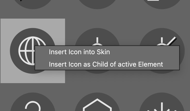
Use the context menu to Insert the component into the skin.
Categories
Categories provide a way to organize the content. You can add (green plus) and remove (red X) categories. The default categories are marked with a star and cannot be removed.
User-defined content can be moved to other categories by dragging them into the category.
Select multiple categories by doing any of the following:
-
Control-click [win] or Command-click [macos] on the categories.
-
Click the Select All Categories button above the categories.
Filter
Filtering is helpful for finding specific components. You can use Text or Tags or both to filter.
For example, if you want to find all Orb components that have pop-ups, select all Categories, then type, pop for the Text and select Orb for the Tag. You would then see all components that include the text, pop, and are tagged Orb.
Text – Filter the components with any text string. Text added to the Information section is searchable.
Tags – Filter the components with any tags.
Reset Filter – Click to clear all filters.
Information
This section provides information about the selected content. Built-in content information cannot be changed. However, any user-defined content can have its information changed.
Title – The title of the component, icon, or animation.
Author – Give credit to the person who created the component, icon, or animation.
Copyright – Add copyright information.
Tags – Add tags. Tags added here will show up in the Tags menu in the Filter section.
Description – Add information about the component, icon, or animation you find necessary. We use it to provide instructions on how to use components, for example.
Preview
This is a preview of the selected component.
Right-click the preview to change the image in User-defined content. Or, drag in the preview image to change it.