Create Tooltips
Tooltips are the bit of text that appears when a mouse enters an element or area that uses them. They are widely used for node type hotspots and show the title of the next node or as information pop-up texts. They can also be used to simply show information.
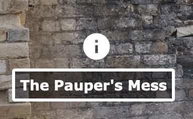
Create a simple tooltip
-
Add a point hotspot.
-
In the Properties, select Info as the hotspot’s Type.
-
Enter text in the Title field. This will be your tooltip text. ★ Tip: Click the pencil icon to open a rich text editor.
-
Open the Output panel.
-
Add a Web output.
-
Choose a built-in skin from the skin menu.
These skins have hotspot templates which will apply an icon and text box to the hotspot. If no skin is added, or a skin with no hotspot template is applied, then you will see the default hotspot image (a red dot) instead.
If you do not have a skin or use a skin without a hotspot template, then you can customize the text box in the Hotspots pane of the Web Output settings.
-
Output the project and test.
Custom Tooltips
The easiest way to create custom tooltips is to use the point hotspot components found in the Components Toolbox and then swap out the hotspot icon. However, here is a basic outline of how to build the tooltip.
-
Open the Skin Editor.
-
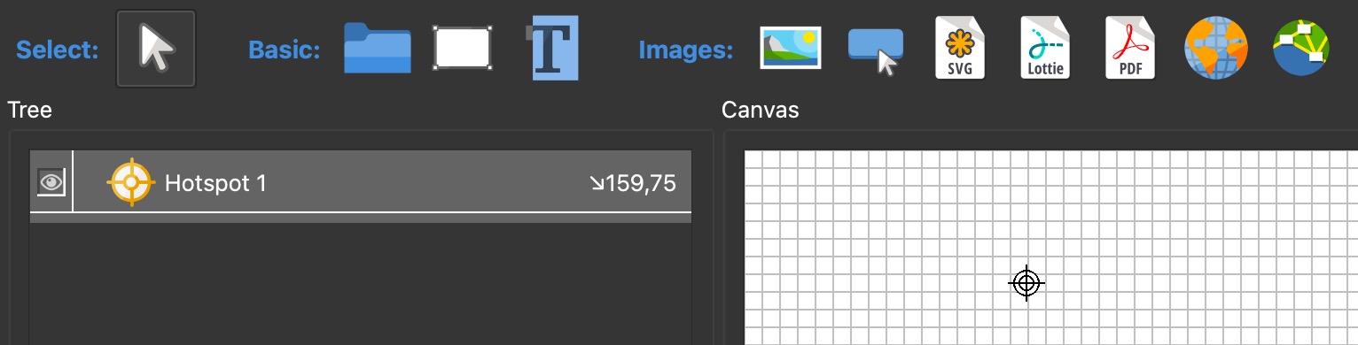
Add a hotspot template. Click the Add hotspot template button, then click in the Canvas to add it.
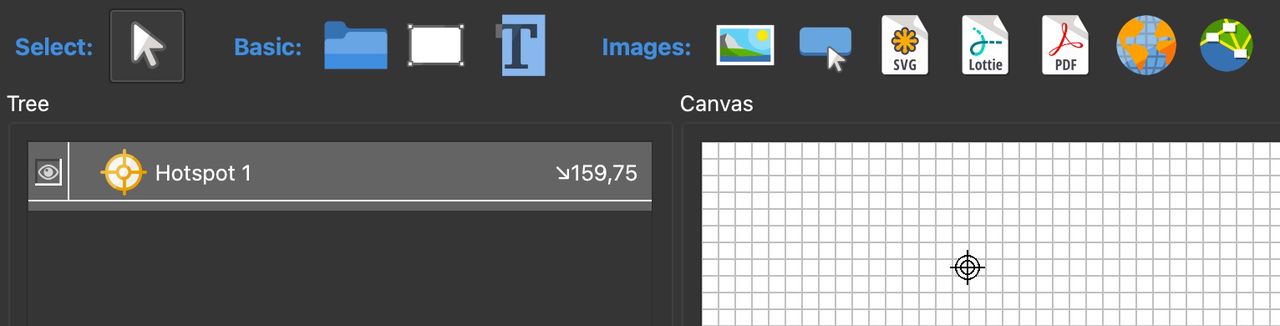
Add Hotspot Template -
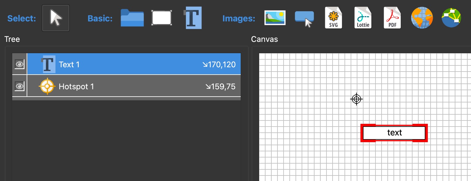
Click the Draw Text Box button, and then click in the Canvas to add a text box. Alternatively, you can draw the shape in the canvas. This will be the tooltip for the hotspot.
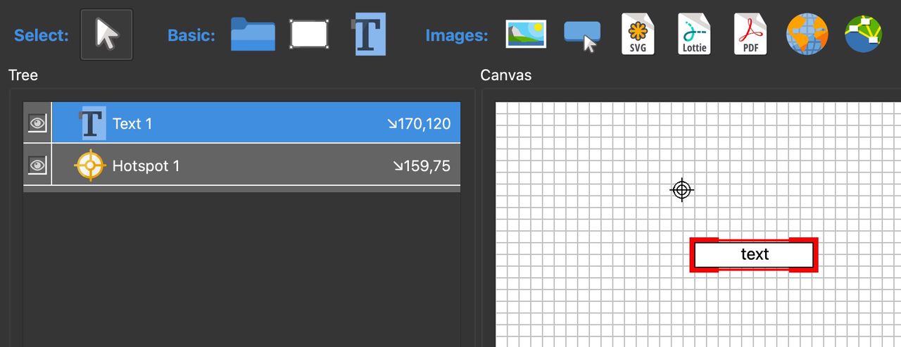
Add Text Box -
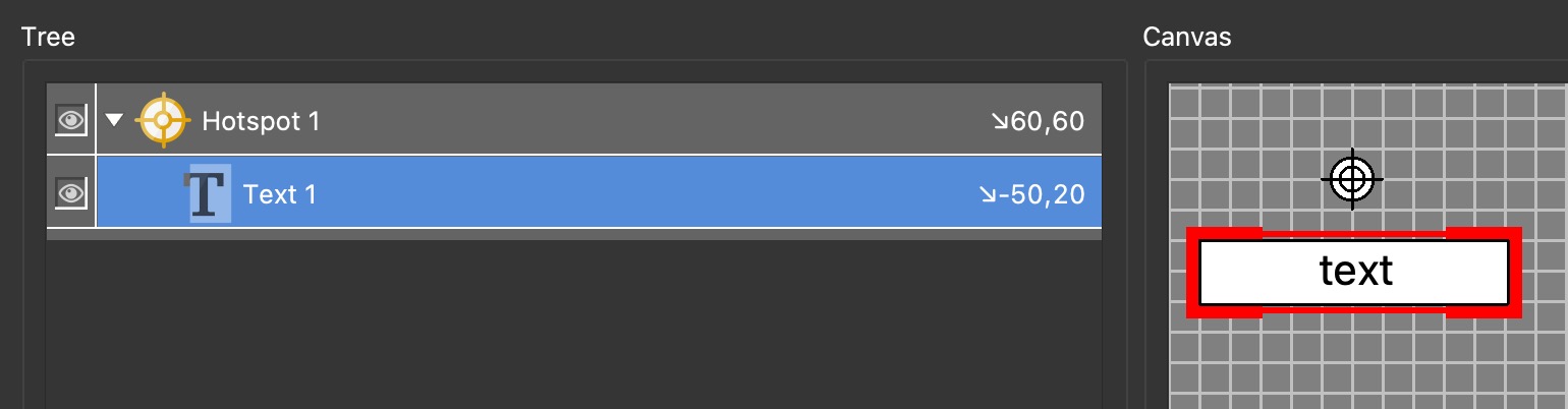
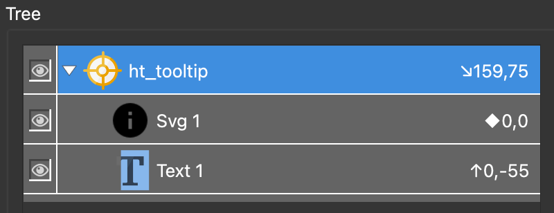
Make the text box a child of the hotspot template. In the Tree, drag the text box on top of the hotspot template.
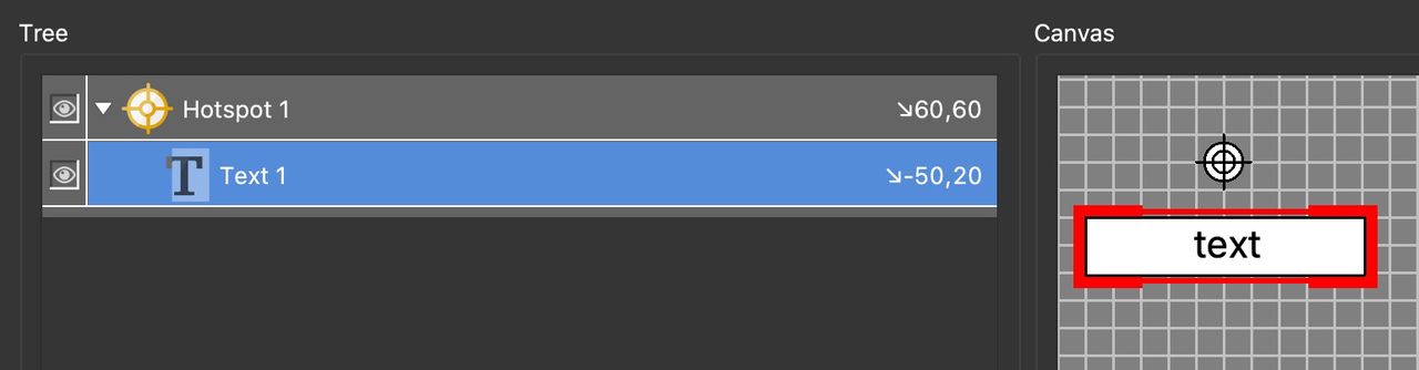
Text Child Element -
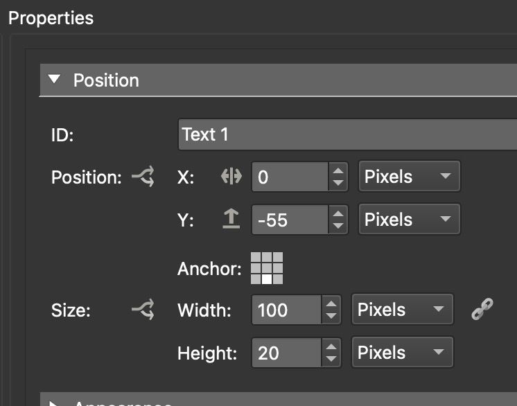
To make sure the text box stays centered, set the Anchor to bottom-center. Reset the positioning (to 0,0) by double-clicking on Position. The text box will then be centered on top of the template. Change the Y value to -55.
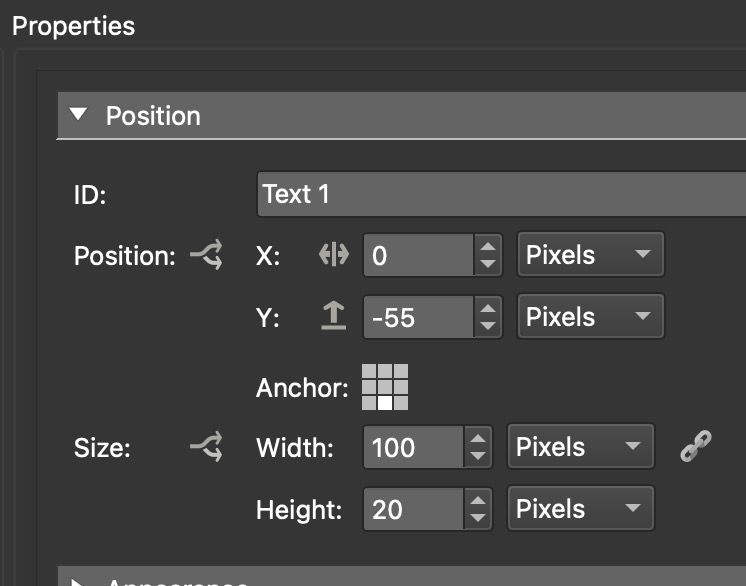
Text Box position settings -
In the Rectangle settings, customize the box. For this exercise, change the Background Color to black with an Alpha Channel value of 120. Click on the color well to open the color picker.

Pick the background color. -
Change the border width to 3 and for round corners, change Radius to 3. Finally, change the Border Color to White.
-
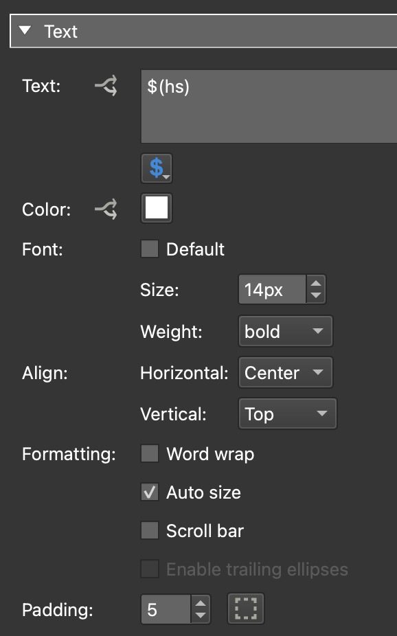
In the Text settings, remove text and find the
$button and choose Hotspots → Hotspot Title $(hs).$(hs)is a placeholder that tells Pano2VR to fetch the information that is entered in the title field in the hotspot properties and to display it in this text box.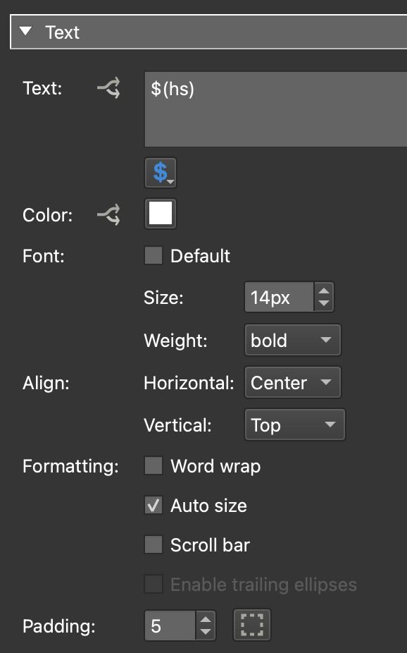
Textbox Properties -
Change the Text Color to White.
-
Change the Font to Bold. Deselect Font and for Weight, choose Bold.
-
Select Auto Size. Add some padding. Here we changed the value to 5.
-
Hide and show the tooltip as the mouse enters and leaves the hotspot. Go to Appearance and deselect Visible.
-
Add a Logic Block to the Visible parameter. Add the following condition:
- Trigger =
Mouse Over Parent - Comparison =
= - Value =
true - Visibility =
trueThis says that whenever the mouse is over the text box’s parent (hotspot template), that the text box will be visible. Add an icon to the hotspot template. We are using one of the icons from the Material collection.
- Trigger =
-
Make the icon a child of the hotspot template. Anchor the icon to the center and reset the position parameters by double-clicking Position. X and Y should be at 0,0.
-
Give the template an ID. Here we use ht_tooltip. When you add your skin to a project, this will appear in the list for Skin-ID. Alternately, you could give it a default ID (ht_info, ht_url, etc.).
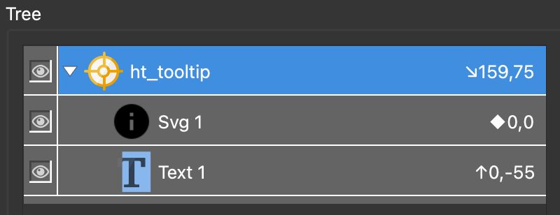
Hotspto Template ID -
Change the color of the icon. Since the icon is an SVG, we can use the Color Tool to change it’s color from black to white. Select the icon and open the Color Tool. Double-click on black (New Color) to open the color palette. Choose White.
-
Save the skin. You could also make this a component.
-
Add your new new skin in the web output settings.
-
Add a point hotspot. For Skin-ID, open the menu and choose the ID you used from the list. (The ID won’t show until you add your skin.)
-
Save the project and output it.
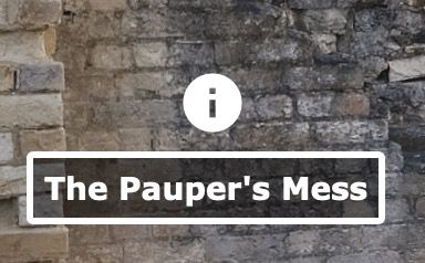
Custom Tooltip

Tooltips or text fields in general, can be further customized using CSS. For instance, you can use CSS to add custom fonts. Take a look at Formatting Text with CSS.