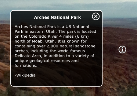
Add an Information Pop-up Box
Hotspots can be used to pop up information boxes.
This process will add an Info type hotspot. This means that an information text window pops up with a title and description. An icon for the text box can also be added. The hotspot and the info icon in the skin are connected via a hotspot template and a Skin-ID.
The easiest way to get an info hotspot icon, is to use the installed Components found in the Components Toolbox or simply use one of the built-in skins. They both have hotspot templates with icons for the text box and a text box already created.
-
Open a project or import a panorama.
-
Select the Point Hotspot Viewer Mode or hit P on the keyboard.
-
Double-click in the Viewer to add the hotspot.
-
In the hotspot properties, choose Info for the Type.
-
Enter a Title and the information text in the Description field.
✭ Basic HTML tags can be used in both the title and description. -
Open the Output panel and select or add an HTML5 output.
-
Add the simplex or silhouette skins.
From here you can output the project.However, if you want to customize the info icon, then continue with the rest of the steps.
-
Open the Skin Editor (use the skin button under the skin section in the Output panel).
-
Open the Components Toolbox, find the Built-in Components.
-
Double-click an Info Popup component to the skin.
-
Save and rename the skin.
-
Output the project.
You’ll now see an image graphic representing the point hotspot and when you click on it, a text box pops up in the center of the screen. Click on the close button to hide it.
If you want swap out the hotspot icon, check out how to create custom hotspot images.
