Logic Blocks and Action Filters
Logic blocks are a way of automatically altering values of skin elements, making it possible to react to certain circumstances using logic. Action Filters are applied to actions and define conditions for the execution of actions assigned to an element.
What is a Logic Block
Logic blocks are a way of automatically altering values of skin elements, making it possible to react to certain circumstances – using logic. These value changes are activated by a wide range of triggers, from window size to user interactions, events from the panorama player, and much more.
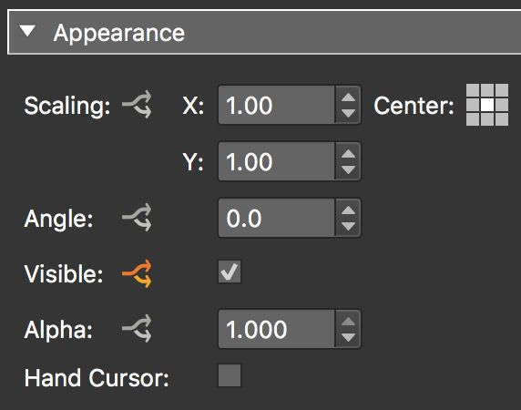
Logic blocks are applied to any skin element. Element properties that use logic blocks have an arrow button next to their name in the properties panel.
If the element has a logic block applied, the arrow is orange otherwise it’s gray. To add a logic block, click the gray arrow icon.
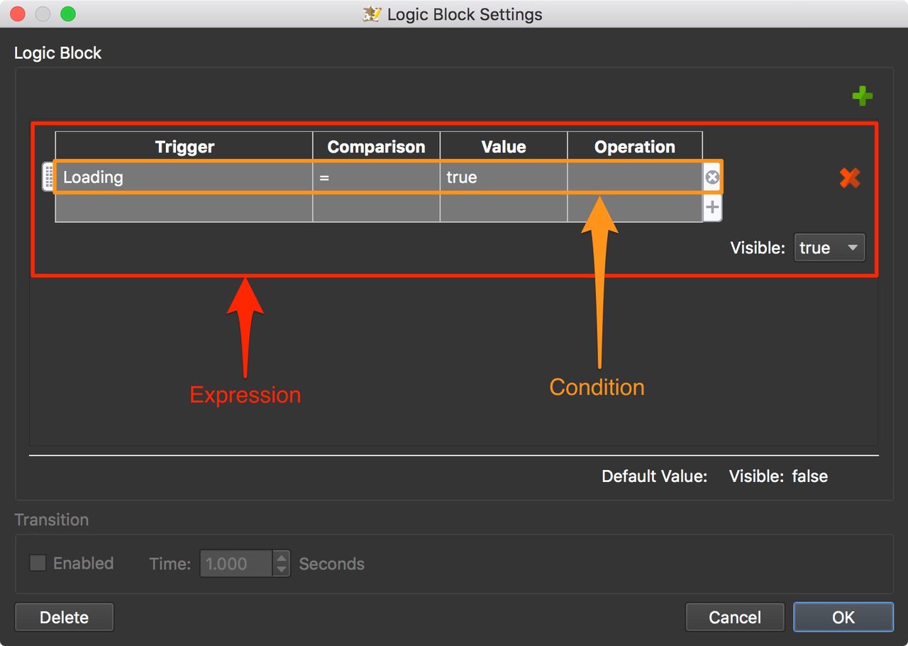
A logic block consists of expressions. Each expression consists of conditions. You can have multiple expressions in a logic block and you can have multiple conditions in an expression.
The Condition
A condition consists of a Trigger, Comparison, Value, and an Operation.
Triggers
The Trigger sets off the logic block or the comparison. Triggers range from mouse events to player window size to variables. For example, if you wanted to hide a skin element when viewed on a phone, you could add a logic block to the Visible attribute and use either the Player Width trigger or the Is Mobile trigger.
| Trigger | Comparison | Value | Operation | |
|---|---|---|---|---|
| Player Width | <= | 800 | ||
| Visible: False |
| Trigger | Comparison | Value | Operation | |
|---|---|---|---|---|
| is Mobile | = | true | ||
| Visible: False |
Comparison
The type of comparison operator available depends on the Trigger. Triggers like Player Width will have a number value, and some triggers will have a text or string value, like the Tag trigger. Some triggers can have more than one type of comparison. For example, placeholders can use =/≠, string comparisons, and regular expressions.
Numerical triggers will use the following comparison values:
=– Equal to≠– Not equal to<– Less than<=– Less than or equal to>– Greater than>=– Greater than or equal to
Triggers that use string values, like Tags and Language, use comparisons for text:
=– Equal to≠– Not equal to- contain – The Trigger has the value
- not contain – The Trigger does not have the value
- start with – the Trigger starts with the value given
- end with – The Trigger ends with the value given
Triggers that can only be true or false (like Is Mobile), only have the = comparison.
Some Triggers can use Regular Expressions as the comparison.
-
regular expression – Enter a regular expression for the value to compare.
★ Note that
#is not used in the syntax for Triggers (as it is for Actions).
Value
Values in Logic Blocks are compared to Triggers to determine the result of the logic block. What is used as a value is determined by the Trigger. There are number values, string (text) values, and boolean values (true/false).
For example, Player Width requires a number value, while Tag, requires a string/text value.
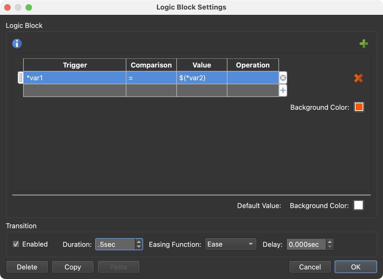
Values can also be placeholders. Right-click in the value cell and the placeholder list will be available.
If you need to build a mathematical equation using placeholders, something that will be evaluated in Javascript and not just a text string, use := at the beginning of that equation: :=$(*pan) + 10.
Operation
Operators allow us to combine multiple conditions to provide a result. For example, if you wanted to hide tooltips when a touch device is being used, you would add the following logic block to a text box’s visible attribute:
| Trigger | Comparison | Value | Operation | |
|---|---|---|---|---|
| Mouse Over Parent | = | True | AND | |
| Has Touch | = | False | ||
| Visible: True |
So, these two expressions must be met if the text box is to be visible.
Default Value
The Default Value is whatever is set in the properties panel of that property. In the image at the top of the page, a logic block was applied to the Visible property which is set to false. That element is initially not visible. It will only become visible when the object movie is loading.
Mode
Some Logic Blocks have two modes: Additive and Absolute.
In Absolute Mode, each expression specifies a value for an element’s attribute, like Position. The expressions are read from the top of the list down to the bottom. The first true expression will be used.
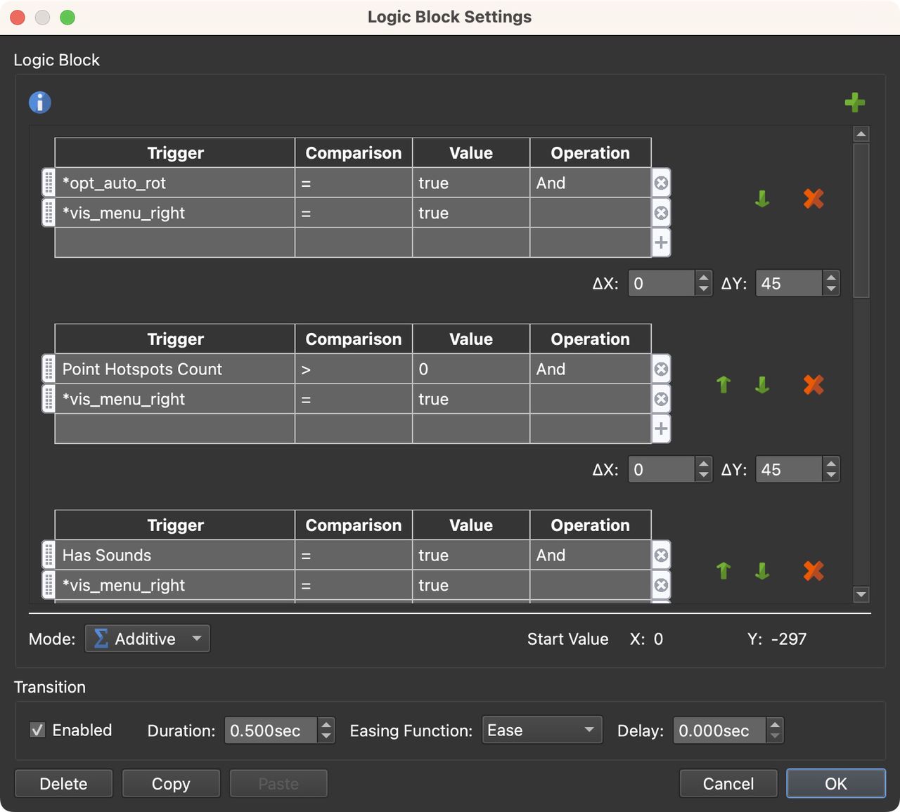
In Additive Mode, every expression will be evaluated, and if true, its value will be added to or subtracted from the element’s default value. In the example below, if any of the expressions are true, the changes to the value will be made. This example is from the menu_right_slider element of the built-in skin, feather_orb.ggsk.
Transitions
The lower section is for Transitions and is available for expressions that will change their size, appearance, location, etc. Select Enabled to set the transition.
-
Duration – Set the amount of time the transition should take to make the change.
-
Easing Function – Choose how the transition behaves by selecting an easing option. Depending on the option, the change will accelerate or decelerate during the movement. Ease in, for example, will start slowly then accelerate. See the options in action:
Loading… -
Delay – apply a delay to the transition in seconds.
Use the Delete button to remove the logic block.
Use the Copy and Paste buttons to copy and paste logic blocks to other elements.
Click Cancel to close the logic block without saving changes.
Click OK to save and apply the logic block.
To add a new expression, click the Add Expression button in the upper right corner. To delete an expression, click the red “x.”
Expressions are read from the top down. This means that the first expression found to be true will be used. If you need to change the order of the expression use the green arrows found next to each expression.
Action Filters
Action Filters are similar to Logic Blocks in that they create expressions with conditions that determine an Action’s execution.
The action filter is opened from within the Action Settings.
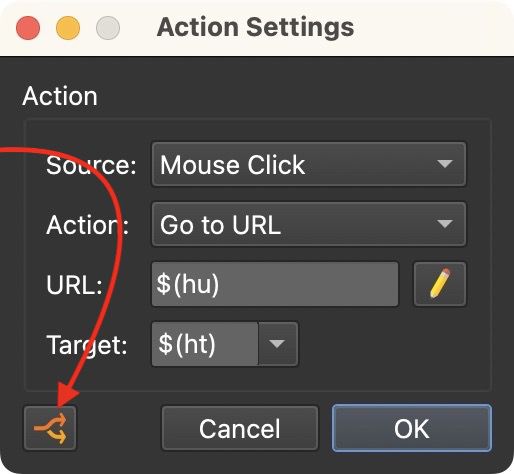
When a filter is applied to an action, the button will turn orange and the action in the actions list will have an asterisk.
