Create a Popup Image with Scrolling Text
Learn how to create a custom image popup with a text box that expands to fit the amount of text.
This popup image with text will be applied to a point hotspot. It’s comprised of a background, an external image loader, a text box, and a screentint.
This popup is useful if you have multiple image hotspots with different images that have varying amounts of descriptive text. The textbox will expand to a specified length to fit the text. Once that length is reached, a horizontal scroll bar will be added.
To follow along, download this project file. It’s from our webinar on Styling Skins. Look for the folder, Image Popup with Text.
You can also create a component from the different point hotspot templates and use them in your projects.
Build the Pop-Up
In the Skin Editor:
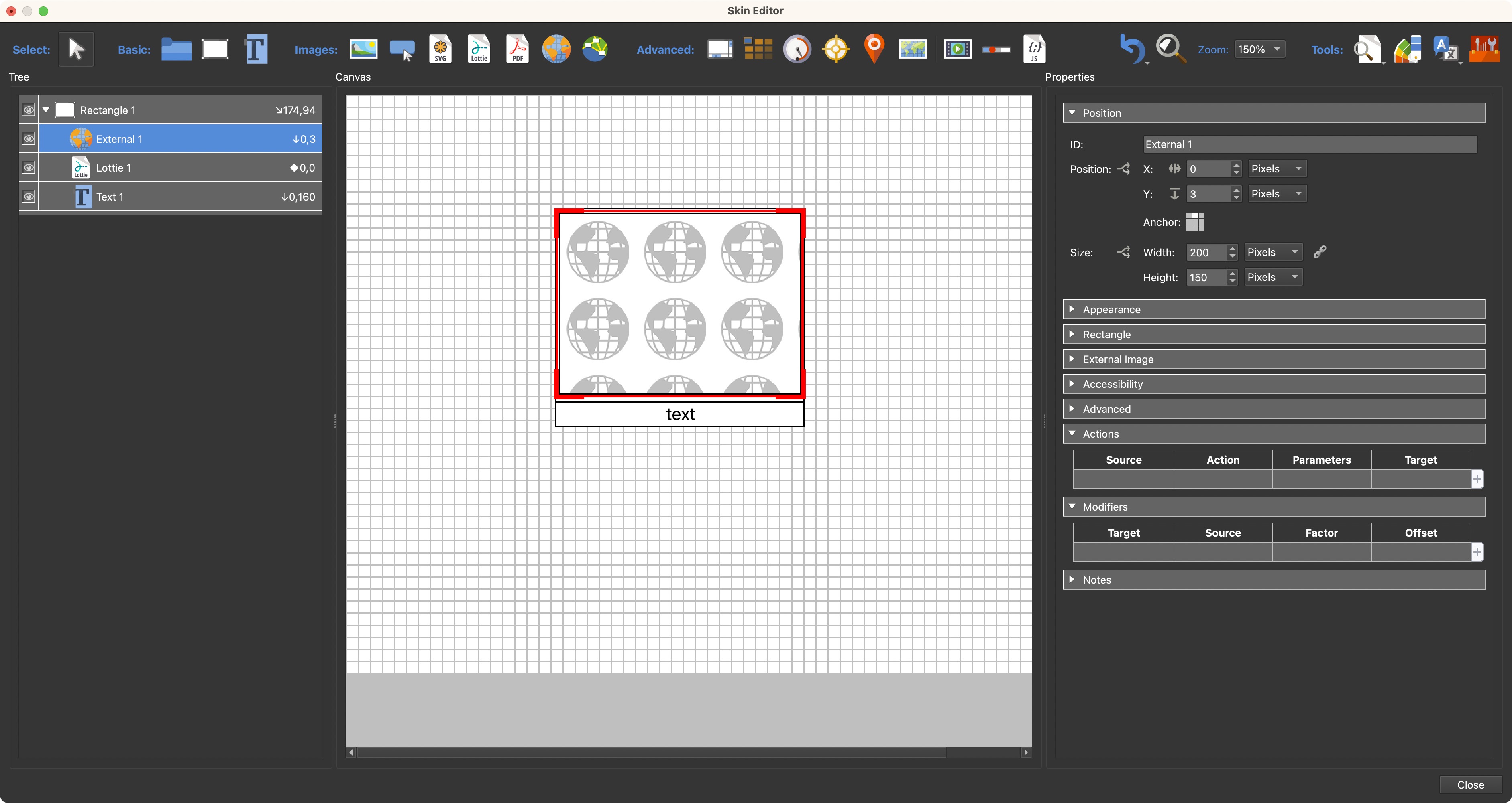
- Draw a Rectangle. This rectangle will act as a container/parent element and a border and background color for the pop up. For this example, it’ll be 206 pixels wide and 160 pixels high.
- Next, draw a Text Box under the Rectangle. This will hold the description for the image. Match its width to the Rectangle.
- Make the Text Box a child of the Rectangle.
- Move the Text Box to have its top align to the bottom of the Rectangle: Set its Anchor to top-center. And it’s position is X=0, Y=160.
- Add a Lottie animation as a loading graphic. This will show if the image hasn’t yet downloaded. It will hide behind the image. Make it a child of the Rectangle and position it in the center of the Rectangle. Anchor is center and postion is 0/0.
- Make changes needed to the animation, like Loop. For endless loop, change Loop to
0. - Add an External Image Loader element and make it a child of the Rectangle. Change its Anchor to top-middle. The external image loader will load the images for each hotspot.
- Place the Image Loader over the Rectangle, leaving about 3 pixels of a border on the top and sides and 7 pixels of the Rectangle showing on the bottom. About 200px wide and 150 pixels high.

Rectangle, Text Box, External Image Loader aligned. - Deselect the External Image Loader (Ctrl/Cmd-click).
- Change background color to blue and reduce the Alpha Transparency for the Rectangle and Text Box.
- Change the Border width to
0. - Deselect the Rectangle and change the color of the Text to white or other contrasting color. You can make any other changes here to the text as well.
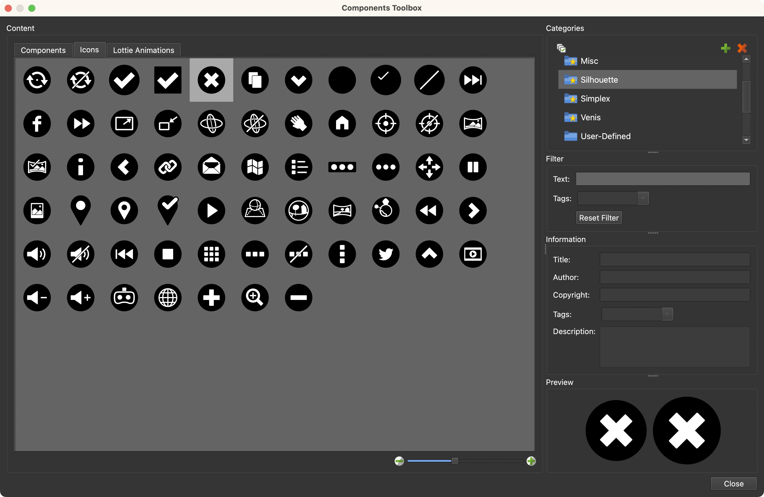
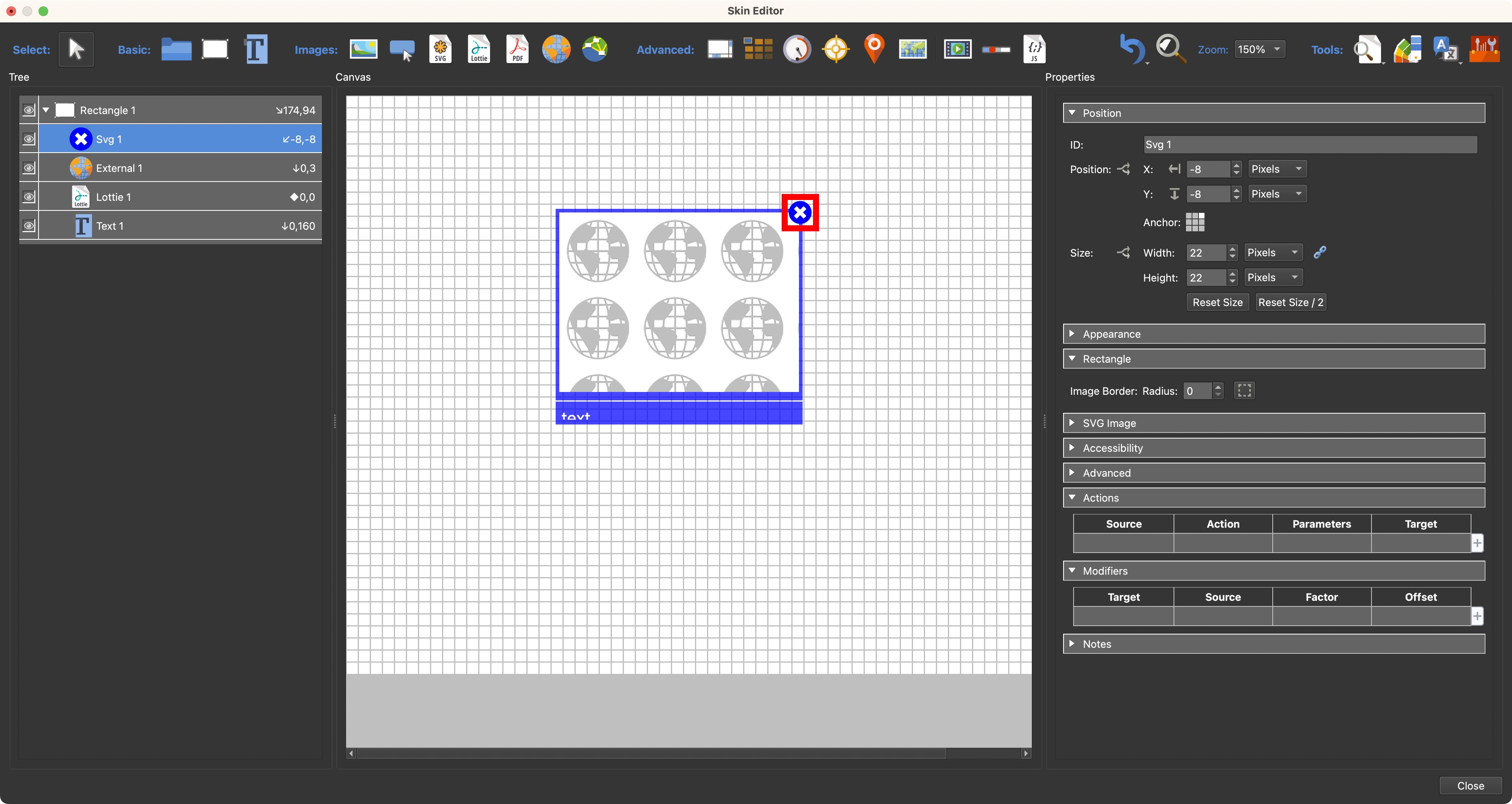
- Add a close button. We’re using one from the Silhouette icons set which includes a 2-state button.

Add a close button. - Make it a child of the Rectangle.
- Change its size to about 22 pixels and position it on the corner of the popup; anchored top-right.
- Change it’s color to the same blue as the pop-up. Open the Color Tool.
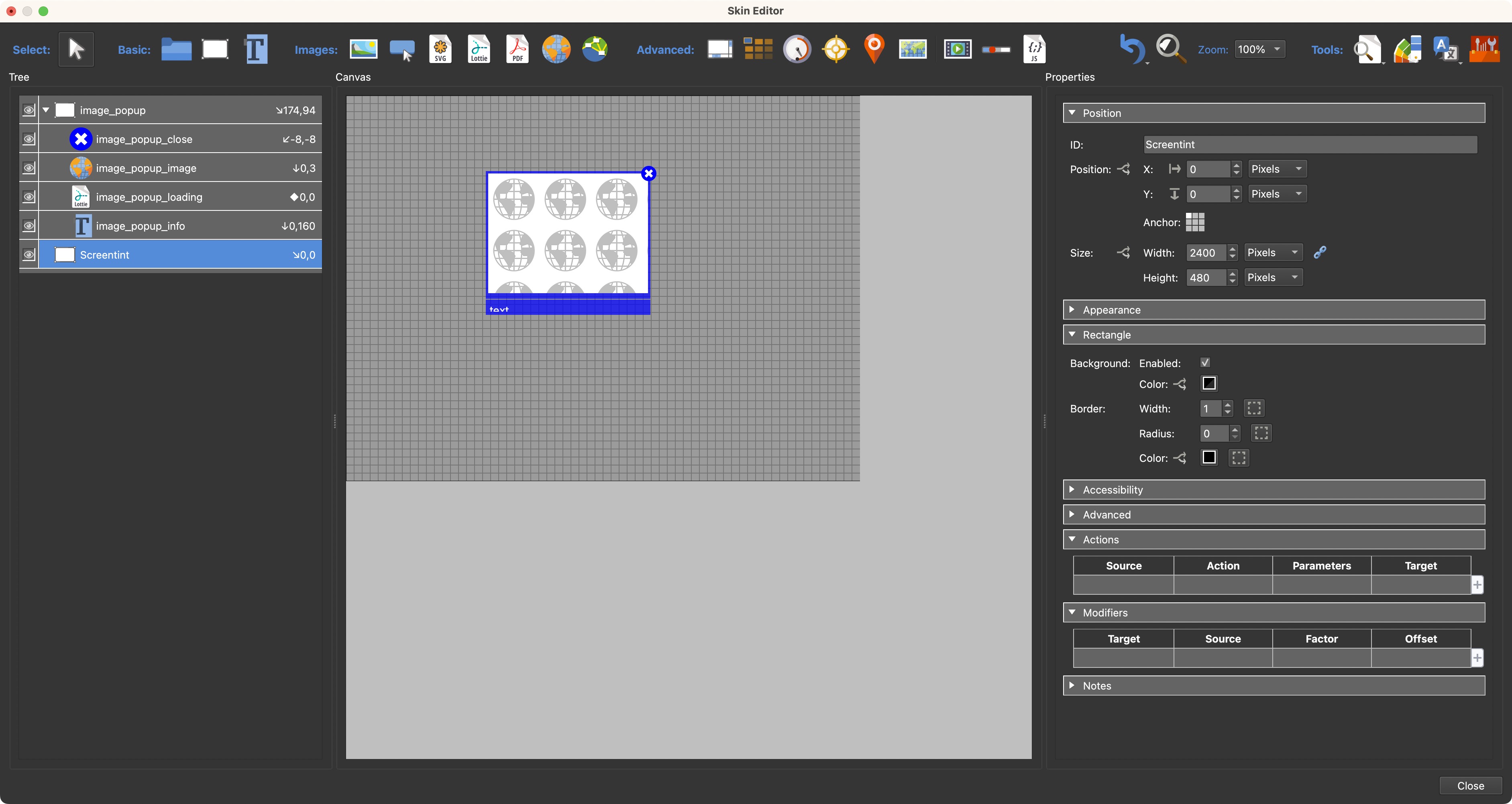
The close button colored blue. - Add a Screentint. This will “gray” out the panorama in the background so the pop-up is easier to see. Add a Rectangle and make it as big as the canvas; Anchored top-left with a position of 0,0.
- Change the background to black with an Alpha Transparency setting of 100.
- Move the screentint under the image pop in the tree so that is shows behind the pop-up.
- Finally, name (change their IDs) the elements accordingly.
Screentint and IDs added.
Add Actions and CSS
Now that the pop-up graphic is built, it’s time to give it some actions and CSS.
-
Add a variable to the Variables table in the Skin settings:
vis_image_popup. It’s Type is True/False and it’s Initial Value is false. -
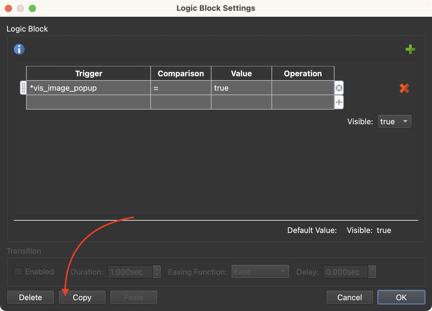
For the Rectangle container, set its visibility to true and add a logic block with the following condition:
Trigger Comparison Value Operation vis_image_popup = true Visible: True -
Copy that expression; we’ll use it again.

Copy the expression. -
Select the External Image Loader in the Tree. Deselect visibility and add a logic block. Paste the condition.
-
Make sure Unload content on hide is selected in the External Image panel. This will make sure the image is cleared before the next one is loaded.
-
Give the Close button an action:
- Source = Mouse Click
- Action = Set Variable Value
- Variable Name =
vis_image_popup - Operation = Set(=)
- Value = False
-
For the Text Box, remove the word Text and select Word Wrap, Auto size, and Scroll bar.
-
Add 5 pixels of padding.
-
In the Text Box’s Advanced panel, add the following CSS to CSS Styles Inner Element:
max-height: 120px;. This will allow the text box to accommodate larger chunks of text by expanding only to 120 pixels. If more space is needed, a Scroll Bar will be added. -
For the Screentint, deselect visible and paste the expression from earlier to the Visible logic block.
-
Add the following action to the Screentint:
- Source = Mouse Click
- Action = Set Variable Value
- Variable Name =
vis_image_popup - Operation = Set(=)
- Value = False
Add a Point Hotspot Template
This popup occurs at a point hotspot and therefore we need to create a template for it.
The easiest way is to use one from the components toolbox. For this example, we’ll use the Silhouette Image Popup component. This component is from Pano2VR version 6 and is also compatible with Object2VR 4. You can download it here.
-
After adding the component, remove the following from the Tree:
- image_popup_close
- image_popup
- screentint_image
-
Give the template a unique ID like
ht_image_text. -
Add the following actions:
This action pulls the image from Image File.
- Source = Mouse Click
- Action = Set Value
- Value =
$(r)$(hu) - Target =
popup_image - Parameter = External URL
This action sets the variable’s value to true and will show the popup.
- Source = Mouse Click
- Action = Set Variable Value
- Variable Name =
vis_image_popup - Operation =
Set(=) - Value = True
This action pulls the text from the hotspot descrption and adds it to the text box.
- Source = Mouse Click
- Action = Set Value
- Value =
$(hd) - Target =
popup_info_text - Parameter = Text
Save the skin. Or save it as a component.
Apply it to a project
- Add an Image type point hotspot.
- Change the Skin-ID to the ID of the point hotspot template.
- Add a title.
- Add a description. The description can be plain text and as long as needed.
- For Image File, navigate to your image to add it. On output, this image will be copied to the output folder.
Repeat steps 2-5 for the rest of the point hotspots.