Components Toolbox
The Components Toolbox holds a collection of predefined skin elements including icons and Lottie animations.
Components are a group of skin elements that can be saved as a single element in the Components Toolbox. If, for instance, you have a button (or group of buttons) that you know you can use with multiple projects/skins, you can save the group to the toolbox. This makes it easier than saving different skin versions because you can categorize and tag them and even add descriptions.
Open the Toolbox from the Toolbar or by choosing Tools > Components Toolbox (Shift-Command-X on macOS, Ctrl+Shift+X on Windows). Components, icons, and Lottie files that were added to the toolbox folders while it was closed show up the next time you open it.
Components Toolbox Interface
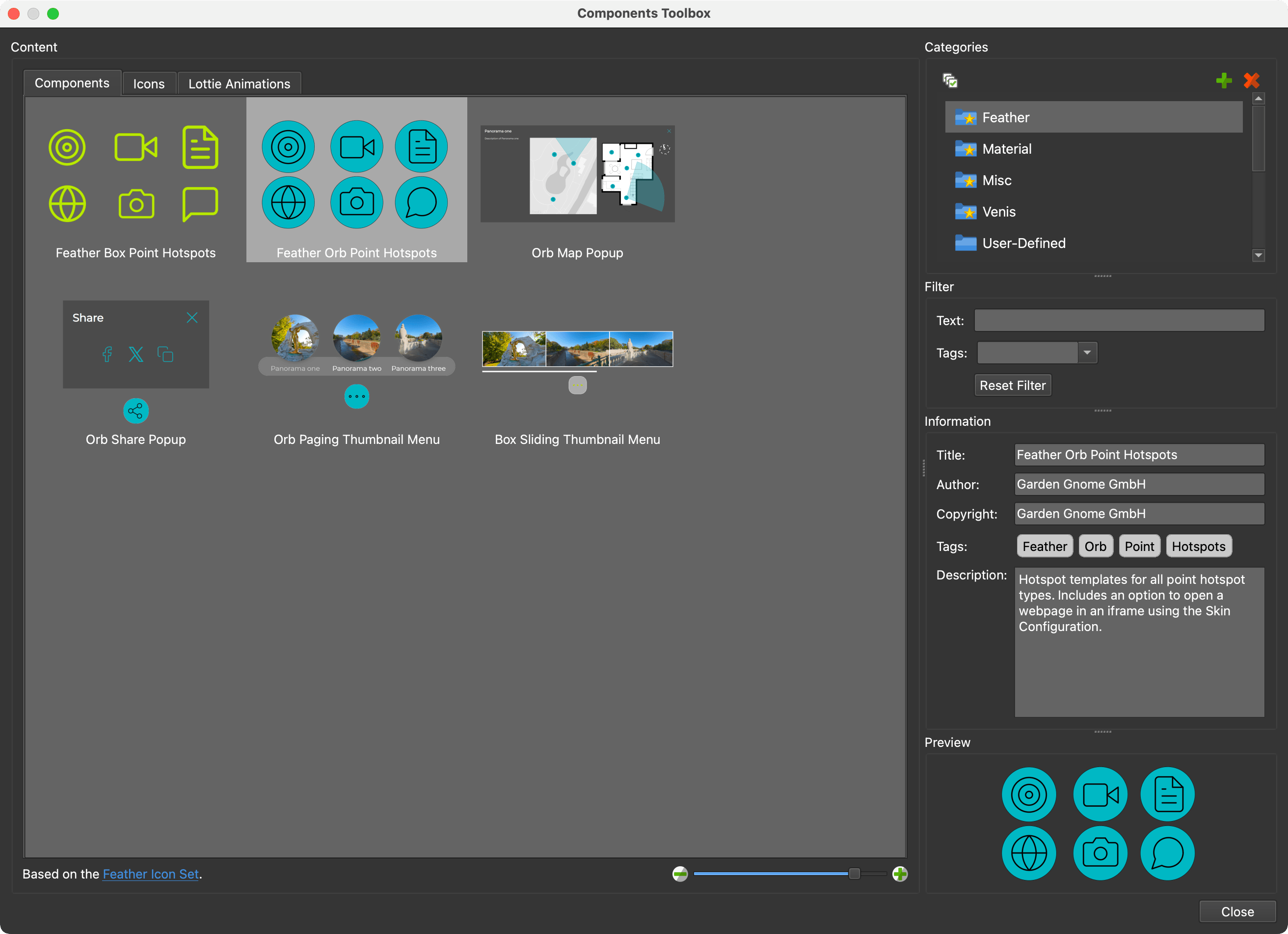
The Toolbox is sectioned into the following parts. Click Close in the lower right corner when you’re done.
Content
The Toolbox holds components, icons, and Lottie files, each on its own tab: Components, Icons, and Lottie Animations. A tab is dimmed when none of the selected categories holds that kind of content.
Use the thumbnail slider in the lower right corner to change the thumbnail size of the grid. Next to it, the lower edge of the section shows the selected category’s description, or how much content is still loading. Click on a component, icon, or animation to select it and have its information shown in the sections to the right. Hover over an icon to see its name and its mouse over state, and press on it to see its active state. Lottie animations and animated SVGs play their animations directly in the grid.
To add an item to the skin, do one of the following:
- Double-click it to add it to the skin as a top level element.
- Drag it onto the Canvas. It lands where you drop it, as a child of the element under the pointer if that element can hold children.
- Drag it onto an element in the Tree to add it as a child of that element.
- Use the shortcut menu (see below).
Press and hold Option (macOS) or Alt (Windows) while you add a component to keep the positions its elements had when the component was saved. If a component needs variables that your skin already has, you’re asked whether to rename the component’s variables (Rename variable(s)) or let it use the skin’s variables (Use skin variable(s)).
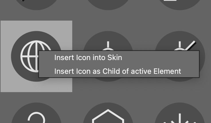
Right-click an item to open its shortcut menu:
-
Add Component to Skin, Add Icon to Skin, or Add Lottie to Skin – Add the item to the skin as a top level element.
-
Add Component as Child of Active Element, Add Icon as Child of Active Element, or Add Lottie as Child of Active Element – Add the item as a child of the element that is currently active in the skin. This entry only appears while an element is active. An icon becomes a new Image or SVG element; an icon with mouse over or active states becomes a Button, or an SVG element with its states.
-
Delete Component, Delete Icon, or Delete Lottie – Remove the item from the toolbox. Built-in content cannot be deleted, so the entry is missing there. An icon that belongs to a component file that also holds a component can’t be deleted on its own; delete the whole component instead.
You can also remove a selected component or icon by pressing Delete (macOS) or Backspace (Windows). Lottie animations can only be removed from the shortcut menu.
To add your own content, select a single user-defined category and drag files onto the matching tab:
- Components – Component files (
.ggskc). - Icons – PNG, JPG, GIF, and SVG files, ZIP archives of icons, and component files that carry an icon set.
- Lottie Animations – Lottie files (
.json).
Drag icons and animations to other categories to move them there.
Icons that have multiple states can be treated as a single icon. Use the file
suffixes _o or _over for mouse over states and _a or _active for the
active state, with the same file extension as the icon:
my_icon_o.svgormy_icon_over.svgmy_icon_a.svgormy_icon_active.svg
A file with one of these suffixes is only treated as a state when the icon it
belongs to, my_icon.svg, is in the same folder. Otherwise it’s an icon of its
own, so an icon named record_voice_over.svg still shows up.
Your own categories and their content are stored in the Skin Components folder set in the Settings.
Icon Folders and Variants
Icons in a category can be organized in sub-folders. When the selected categories hold more than one folder, each folder appears as a collapsible header in the grid. A ZIP archive dropped into a category behaves like a folder, so a complete icon set can be added as a single file.
Folders inside a folder act as variants of the same icons, for example, a filled and an outlined version of each icon. The variant buttons appear below the folder header; click one to switch the grid between the variants. When the folder also holds icons outside its variant folders, a Base button shows those. If an icon is selected when you switch, the same icon in the new variant is selected.
The built-in Icon Sets category collects popular open source icon sets: Spinner, Akar Icons, Basicons, Eva Icons, Forge Icons, HeroIcons, Iconoir, and Ionicons. Select any of their icons to see who drew it and under which license it is published. The icons of Akar Icons, HeroIcons, Iconoir, and Ionicons can also be found by search terms other than their file names; in the larger sets, by the category they belong to as well. The built-in Feather icons come in Box and Orb line-weight variants (matching the two Feather skins), and the built-in Material icons come in Filled and Outlined variants.
The icons in the Feather, Material, Venis and Quaranta categories carry
the same information. Feather and Material name the projects they come from and
the license those are published under, and their icons can be found by the words
those projects publish for them: search weather in Feather, or Navigation in
Material. Venis and Quaranta were drawn by Garden Gnome, and their icons have
names and search terms of their own: the Venis caption_NO icon is Captions
Off, and the Quaranta panoup icon is Look Up.
Icon Sets in Component Files
A component file (.ggskc) can carry an icon set as well. Because a component
file also holds a title, an author, a copyright notice and a description, this
is the way to share an icon set together with credit for whoever drew it. The
Information section shows that credit whenever one of its icons is selected.
A component file is a ZIP archive. To turn one into an icon set, put the icons
in a folder called icons and add an <iconset> line to its info.xml:
<componentinfo>
  <title>Akar Icons</title>
  <author>Arturo Wibawa</author>
  <copyright>MIT</copyright>
  <source>https://github.com/artcoholic/akar-icons</source>
  <license>https://github.com/artcoholic/akar-icons/blob/master/LICENSE</license>
  <iconset>icons</iconset>
</componentinfo>
<source> and <license> are optional and work for any component, not just an
icon set. Both appear under the description in the Information section, as
links when they are web addresses. A component’s info.xml can also list its
tags in a <tags> line, separated by |.
The text of the <iconset> line is the folder the icons live in; leave it empty
to use icons. Folders inside that folder are
variants, exactly as they are in a ZIP. Anything
outside it is left alone, which is why a component’s own images never turn up in
the Icons tab.
A large set is easier to browse in groups. Add an <iconset> line per group and
give each one a name, and every group gets its own heading in the Icons tab,
still from a single file:
<iconset name="Weather">icons/Weather</iconset>
<iconset name="Transport">icons/Transport</iconset>
The same file can be a normal component and an icon set. It then appears in both the Components and the Icons tab, so a skin and its matching icon library can be shared as a single download.
Naming Icons
Icons are normally named after their files, which does not help much when you
are looking for a house and the file is called home.svg. Add a file called
icons.json to give them proper names, descriptions and search terms. It works
in a ZIP archive, in a component file, and in a plain folder.
{
  "format": "pano2vr-icon-set",
  "version": 1,
  "variants": { "outline": "Outline", "filled": "Filled" },
  "icons": {
    "aperture": {
      "title": "Aperture",
      "description": "Camera aperture blades.",
      "keywords": ["camera", "photo", "lens"]
    },
    "arrow-left": {
      "keywords": ["previous", "back"]
    }
  }
}
format and version – Required, exactly as shown above. A file without them is ignored.
icons – One entry per icon, named after the icon’s file without its
extension. The entry covers every variant and every state of that icon, so a
single home entry also describes home_o.svg and the copy of home.svg in
each variant folder.
title – The icon’s name, shown when you hover over the icon and in the Information section.
description – A sentence about the icon.
keywords – Words the Filter finds the icon by, for terms that do not appear in its file name.
variants – Names for the variant buttons, so a folder called outline can
read Outline.
Everything else is optional: an icon with no entry keeps its file name, and a
set with no icons.json behaves as it always has.
Put icons.json where the toolbox looks for it:
- In a plain folder, next to the icons or their variant folders, not inside a variant folder.
- In a ZIP archive, at the top level or one folder down.
- In a component file, in the folder named by the
<iconset>line, oneicons.jsonper group.
A plain folder of icons has no info.xml to credit whoever drew them, so its
icons.json can carry that as well, in a set block beside the icons:
{
  "format": "pano2vr-icon-set",
  "version": 1,
  "set": {
    "title": "My Icons",
    "author": "Jane Doe",
    "copyright": "CC BY 4.0",
    "description": "Drawn for the lobby tour.",
    "source": "https://example.com/icons",
    "license": "https://creativecommons.org/licenses/by/4.0/"
  }
}
The Information section shows this for every icon in the folder that has
nothing more specific to say. In an archive the info.xml is what counts, so a
set block there only fills in what info.xml left out.
Categories
Categories provide a way to organize the content. The built-in categories come first (Feather, Material, Venis, Quaranta, Misc, and Icon Sets), are marked with a star, and cannot be changed or removed. After them come User Defined and your own categories in alphabetical order.
- Add Category (green plus) – Adds a category called New Category, ready to be renamed.
- Remove Category (orange X) – Removes the selected user-defined category. If it holds components, you’re asked to confirm, because they’re deleted too. User Defined cannot be removed.
- Select All Categories – Selects every category.
Double-click one of your own categories to rename it. User-defined content can be moved to other user-defined categories by dragging it onto the category.
Right-click a user-defined category and choose Open Category Folder in Finder (macOS) or Show Category Folder in Explorer (Windows) to open its folder.
Select multiple categories by doing any of the following:
-
Command-click (macOS) or Ctrl+click (Windows) on the categories.
-
Click a category, then Shift-click another to select the range between them.
-
Click the Select All Categories button above the categories.
A category folder can hold an info.json file with a description, shown at
the bottom of the Content section when that category is selected, an order
list of folder names, and an openAtStart entry that says which folders start
expanded:
{
  "description": "Icons for the lobby tour.",
  "order": ["Navigation", "Media"],
  "openAtStart": { "Navigation": true, "Media": false }
}
Filter
Filtering is helpful for finding specific components. You can use Text or Tags or both to filter.
For example, if you want to find all Orb components that have pop-ups, select all Categories, then type, pop for the Text and select Orb for the Tag. You would then see all components that include the text, pop, and are tagged Orb.
Text – Filter with any text string. On the Components tab, this searches the title, author, copyright, and description from the Information section. On the Icons tab it searches an icon’s file name, name, folder, variant, description, author, and search terms. On the Lottie Animations tab it searches the file name.
Tags – Filter with any tags. When you choose several tags, only the items that have all of them are shown. It works on the Icons tab too, where the tags are the icons’ own search terms: the words in the Tags row of the Information section. Components and icons keep separate tag lists, because the tags you file a component under have nothing to do with an icon set’s search terms, so switching tabs clears the tags you picked. Tags are not available on the Lottie Animations tab.
Reset Filter – Click to clear all filters.
Information
This section provides information about the selected content, in this order. The information of your own components can be edited; built-in components, icons, and Lottie animations are read-only. For a Lottie animation the section stays empty, and for an icon it only shows what its icon set says about it.
Title – The title of the component or icon. Component titles must be unique within their category.
Author – Give credit to the person who created the component or icon.
Copyright – Add copyright information.
Tags – Add tags. Tags added here show up in the Tags menu in the Filter section. For an icon these are the search terms its icon set gave it.
Description – Add information about the component you find necessary. We use it to provide instructions on how to use components, for example.
Source – Where the content came from. Shown only when it says so, and clickable when it is a web address.
License – What the content is licensed under. Shown only when it says so, and clickable when it is a web address.
Preview
This is a preview of the selected item. An icon shows its normal, mouse over, and active states side by side, and a Lottie animation plays.
To change the preview image of one of your own components, right-click the preview and choose Change Preview Image, or drag a PNG or JPG file onto the preview.
Picking an Image from the Toolbox
Some properties let you pick their image straight from the toolbox: the Pick graphic from components toolbox buttons next to the images of Image, Button, SVG, and Lottie elements, and the custom image of a point hotspot. The toolbox then opens with only the tab that fits (Icons for images and SVGs, Lottie Animations for Lottie files) and without the Information section. Select an item and click Ok, or double-click it. For a mouse over or pressed state, the icon’s matching state file is used when the icon has one.