Creating Skins
Use the Skin Editor to create and design interactive overlays for your virtual tours.
Introduction to the Skin Editor
Learn more about the Skin Editor’s layout, its main controls, and the elements:
The Basic Workflow
-
Open the Skin Editor using any of the following methods:
-
Customize the layout of the canvas in the Properties section:
-
Make sure no elements are selected. In the Properties section, Canvas panel, choose the size of the canvas and change the grid size.
-
Zoom in to the canvas using the Zoom control in the Toolbar.
-
-
Add elements to the skin. These can be buttons, images, SVGs, sounds, videos, external elements, or components.
-
Go to the Toolbar and select any element, then click in the Canvas to add.
-
In the menu bar, choose an element from the Elements menu and then click in the Canvas to add it.
-
Drag the elements on to the canvas.
-
-
Arrange the elements.
-
Select an element either in the Tree or in the Canvas and drag to place.
-
Use a Container to group elements.
-
Right-click elements in the Tree to cut, copy, paste, or lock them, or to create a component from them. Right-click selected elements in the Canvas to align, distribute, or center them, or to match their sizes.
★ Tip Use the Tab key to change focus from the Tree to the Canvas to use the arrow keys to move elements. Hold Shift when using the arrow keys to move in increments of 10 pixels.
-
-
Apply actions to elements for user interactivity and control.
Select any element and go to the Actions panel in the Properties section. Double-click the empty table row or click the green plus icon.
For example, to make a button pan left, choose Mouse Click as the Source, Panorama Movement as the Action, and Pan Left as the Type.
-
Save the skin.
The first time you save a new skin in a saved project, you’re asked where to save it:
- Project Directory – Saves the skin with the current project. Choose this for a skin created or modified specifically for that project.
- Skins Directory – Saves the skin in the configured Skins folder, making it available for selection in other projects. You’ll be able to select it from the menu in the Web Output.
To save a copy of any skin straight into the Skins folder later, choose File > Save as (default skins folder)….
Built-in Skins
Pano2VR ships with fully functioning skins that you are free to use for your projects. You will find these skins in the Skin menu of the web output settings.
Each skin supports all pinned media and tours but not all support maps or have share buttons. Below is a general preview of what each skin features. There are also two VR skins which are found in the VR section of the Web Output Properties.
Depending on the browser, skins that have share buttons will have individual share buttons for desktop browsers or they will show only a share button for browsers that support the Web Share API.
Most built-in skins (all except Material Dusk and Material Index) also show the project description from the Project User Data in their info popup. Each skin has options, like buttons to show or hide, that you can set without the Skin Editor in the output’s skin configuration.
gg_skinstyle to its style name (for example, Feather_Box or Quaranta). Components can read this variable to adapt to the skin they are added to; the Measure Tool uses it for its Auto style.Feather Box
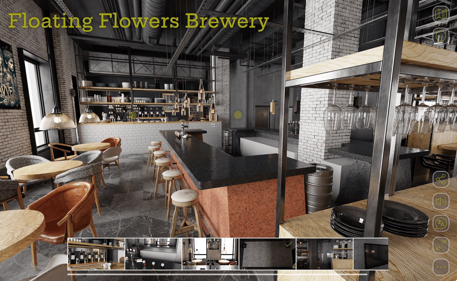
feather_box.ggsk
- animated, rectangular node hotpots with preview
- project title
- customize color
- supports translations
Feather Orb
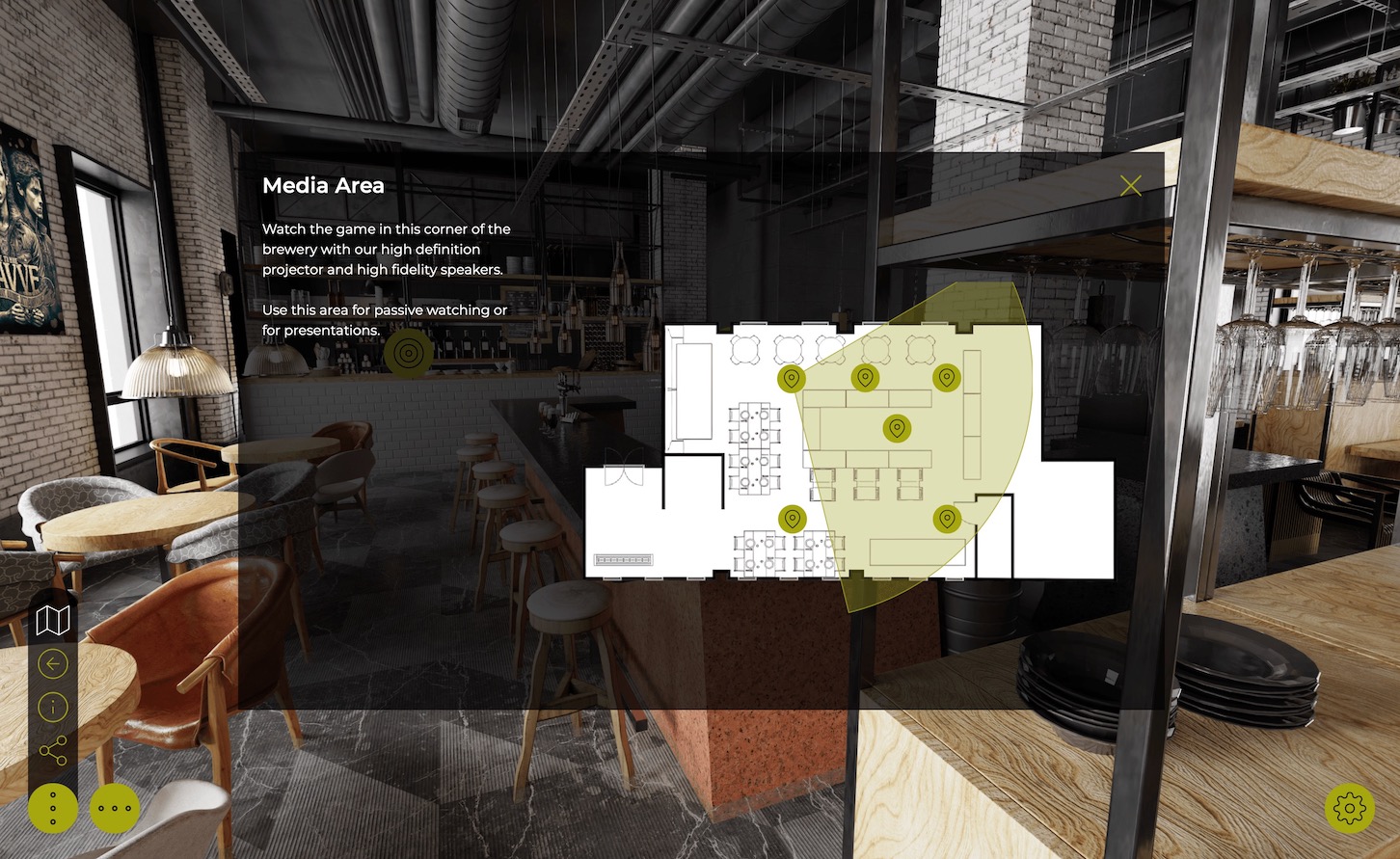
feather_orb.ggsk
- animated, circular node hotspots with preview
- thumbnail menu
- map and floor plan
- project title
- autorotate
- customize color
- supports translations
Material Dart
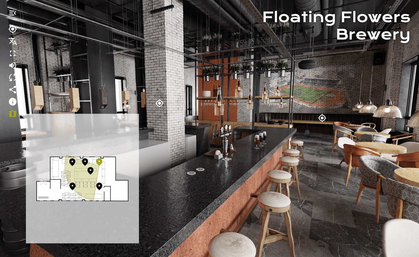
material_dart.ggsk
- project title
- no node previews, no thumbnail menu
- dropdown menu, categories
- animated hotspots
- mute buttons
- share buttons
- map and floor plan
- customize color
- supports translations
Material Dusk
material_dusk.ggsk
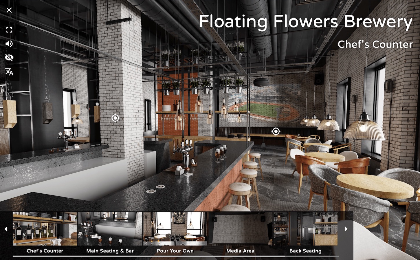
- customize color
- project title
- animated hotspots, no previews
- thumbnail menu
- Mute/unmute
- no map buttons
- no share buttons
- supports translations
Material Index
material_index.ggsk
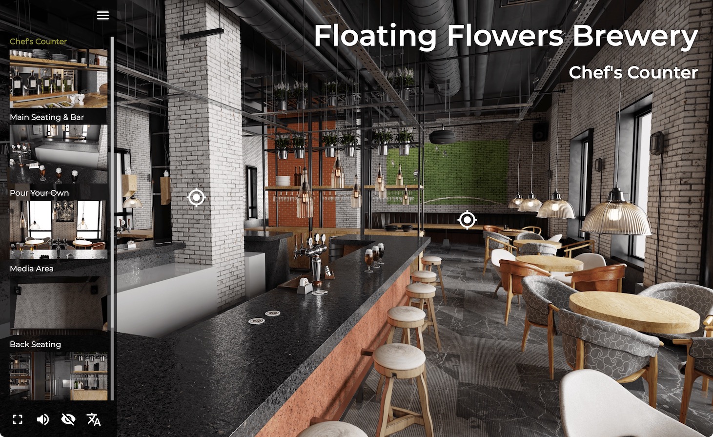
- vertical thumbnail menu
- supports categories
- change color
- project title
- no share buttons
- animated hotspots, no previews
- no map or floorplan
- supports translations
Neto
neto.ggsk
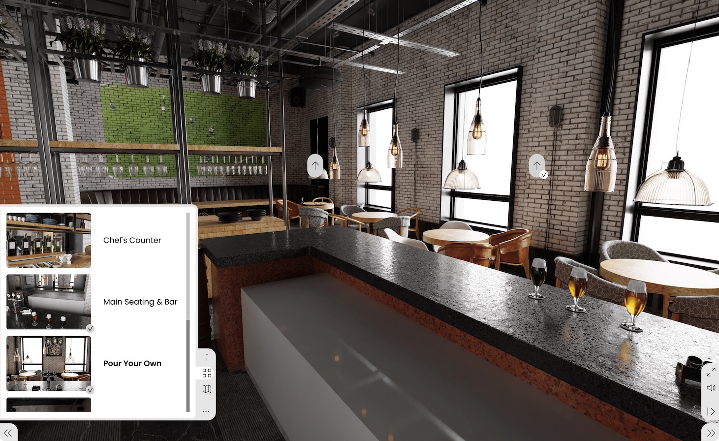
- nodes with previews and titles
- thumbnail menu
- supports categories/sub menus
- map and floor plan
- no share buttons
- optional controller
Quaranta
quaranta.ggsk
- features navigation arrows with preview images
- thumbnail menu, which can open on start
- map and floor plan
- dark and light themes
- varying shapes for hotspots (square, rounded corners, or circle)
Venis
venis.ggsk
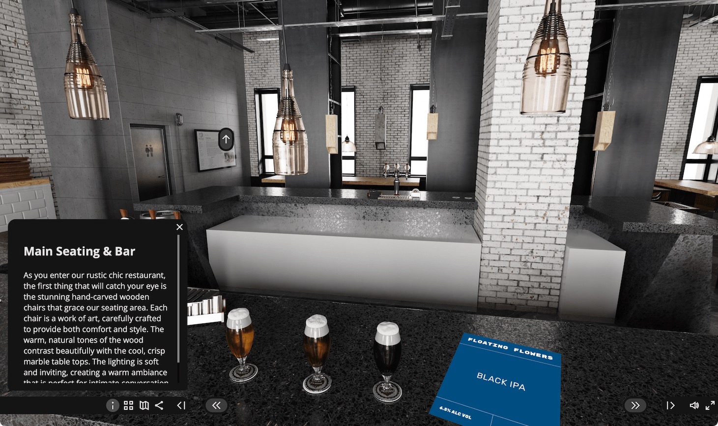
- thumbnail grid menu
- floor plan and map
- share buttons
- controller
Comparison Chart
| Feature | Feather Orb | Feather Box | Material Dart | Material Index | Material Dusk | Neto | Quaranta | Venis |
|---|---|---|---|---|---|---|---|---|
| Animated Hotspots | ✔︎ | ✔︎ | ✔︎ | ✔︎ | ✔︎ | |||
| Rectangular node hotpots with preview | ✔︎ | |||||||
| Round node hotpots with preview | ✔︎ | |||||||
| Project Title | ✔︎ | ✔︎ | ✔︎ | ✔︎ | ✔︎ | |||
| Customize Color | ✔︎ | ✔︎ | ✔︎ | ✔︎ | ✔︎ | ✔︎ | ||
| Translations | ✔︎ | ✔︎ | ✔︎ | ✔︎ | ✔︎ | |||
| Map/Floorplan | ✔︎ | ✔︎ | ✔︎ | ✔︎ | ✔︎ | ✔︎ | ||
| Fullscreen button | ✔︎ | ✔︎ | ✔︎ | ✔︎ | ✔︎ | ✔︎ | ✔︎ | |
| Autorotate button | ✔︎ | ✔︎ | ||||||
| Dropdown Menu/Categories | ✔︎ | ✔︎ | ||||||
| Mute button | ✔︎ | ✔︎ | ✔︎ | ✔︎ | ✔︎ | ✔︎ | ✔︎ | |
| Hide hotspot button | ✔︎ | ✔︎ | ||||||
| Share button | ✔︎ | ✔︎ | ✔︎ | |||||
| Thumbnail Menu | ✔︎ | ✔︎ | ✔︎ | ✔︎ | ✔︎ | ✔︎ | ✔︎ | |
| Controller | ✔︎ | ✔︎ |