Skin Editor Menu Bar
The menu bar is found at the top of the program's window in Windows and Linux or at the top of the screen in Mac OS. This is the menu bar for the Skin Editor only.
File
-
New – Opens a new skin document and will close any previously opened skin document. If it has not been saved, you’ll be asked to save it before it closes.
-
Open – Open an existing skin.
-
Save – Save the current skin. The built-in skins are read-only, so saving one opens the save dialog with a name for a copy already filled in. See Saving and Closing.
-
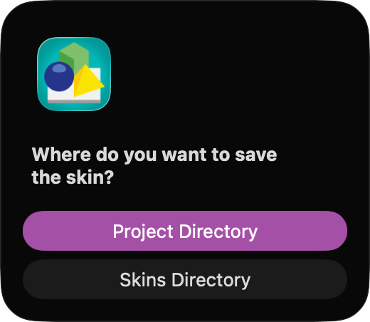
Save as… – Save the current skin with a different name or location. If the skin has never been saved and the project has been saved, you’re first asked where to save it: in the Project Directory, next to the project file, or in the Skins Directory, the configured Skins folder. Skins in the Skins folder appear in the skins menu of the Web Output, so you can use them with other projects.
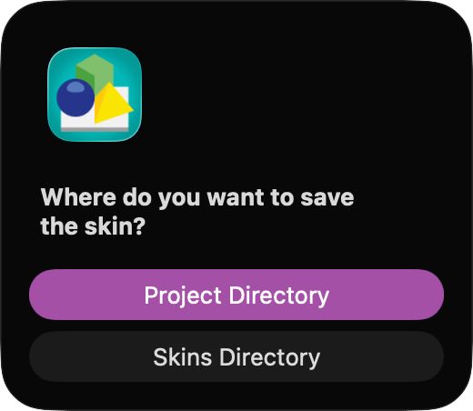
Save skin dialog. -
Save as (default skins folder)… – Save the current skin straight into the configured Skins folder, without the question above. The save dialog opens in that folder with the skin’s current file name, so you can keep a copy of a project skin for use in other projects. The VR Skin Editor saves into the VR Skins folder instead. Give a copy of a built-in skin a new name, because the built-in skins can’t be overwritten.
-
Recent Files – Open recent skin projects.
-
New Window – Opens a new Skin Editor window and allows for multiple skin documents to be opened at a time.
-
Close Window – Closes the Skin Editor. If the skin has unsaved changes, you’re asked whether to save them. See Saving and Closing.
Edit
-
Undo – Undo an action.
-
Redo – Redo an action.
-
Cut – Remove an element.
-
Copy – Copy an element.
-
Paste – Paste an element.
-
Find… – Open the Search for the skin. When an element is selected, the search starts with that element’s ID.
-
Find Element Usage… – Open the search to find all places where the selected element is used in the skin.
-
Rename Element… – Open the search to rename the selected element.
-
Find Warnings… – Opens the search and locates any warnings that may occur in the skin.
-
Hide in Canvas – Hide or unhide the selected element(s) in the Canvas. This only affects the editor; to make an element invisible in the output, deselect Visible in its properties.
-
Lock in Canvas – Lock the selected element(s) in the Canvas. Once an element is locked it cannot be accidentally moved or altered in the Canvas. It can, however, be cut, copied, pasted, rearranged within the Tree and its Properties can be modified.
-
Reveal in Canvas – The selected element will be brought into view in the Canvas.
-
Reveal in Tree – The selected element will be revealed in the Tree. The Tree will expand all parent elements of the current element and, if needed, scrolls to show the current element.
-
Expand Element – This will open the expanded view of the element. It is available for elements like, Scroll Area and Cloner. In the expanded view you can edit the encompassed elements.
-
Anchor Element – Set the anchor point of the selected element(s). Choose one of the nine anchor positions (Top Left through Bottom Right) from the submenu.
-
Align Elements – Align the selected elements. The elements will be aligned to the active element.
-
Distribute Elements – Distribute the selected elements (3 or more). This will evenly distribute the elements.
-
Center Elements in Canvas – Centers the selected elements in the Canvas. You can center the elements both horizontally and vertically.
-
Match Size of Elements – Match the size of the selected elements to the size of the active element. Choose to match the Width, Height or Both.
-
Create Component from Skin – This will save the current skin’s elements as a Component in the components toolbox.
-
Create Component from Selection – This will save only the currently selected elements as a component. When you update an existing component, press and hold Option (macOS) or Alt (Windows) while you choose this command to keep the component’s preview image.
-
Select All – Select all the elements.
-
Deselect – Deselect the elements.
Elements
For all elements, select them from the menu and then click in the Canvas to add the element.
-
Select – This activates the Select tool.
-
Container – Adds a container to the skin. Draw the container around elements in the Canvas or just click within the Canvas to add a default container.
-
Rectangle – Adds a rectangle to the skin with a default size of 100 pixels x 20 pixels. Click in the Canvas to add or drag to draw the Rectangle.
-
Text – Adds a text field to the skin with a default size of 100 pixels x 20 pixels. Click in the Canvas to add or drag to draw the Text box.
-
Image – Choose to import an image (or images) to the skin. Click within the Canvas to open a dialog. Choose the image and click, Open.
-
Button – Choose to import a button (or buttons) to the skin. Click in the Canvas to open a dialog. Choose the button and click, Open.
-
SVG – Choose to import an SVG file (or more) to the skin. Click in the Canvas to open a dialog. Choose the image and click, Open.
-
Lottie Animation – Adds a lottie animation to the skin. Choose one from the dialog.
-
PDF – Add a PDF file to the skin. After selecting this option, click in the canvas and then navigate to the PDF file in the dialog.
-
External – Adds an externally located image/URL to the skin. Click in the Canvas to add a default sized image or drag to draw desired size.
-
Node Image – This will add a place holder for a node preview image. Click in the Canvas to add. Requires a Pro license.
-
Scroll Area – Adds a scroll area with a default size of 100 pixels x 20 pixels. Click in the Canvas to add or drag to draw the area.
-
Cloner – Adds a Cloner to the skin.
-
Timer – Adds a Timer to the Canvas. Click in the Canvas to add or drag to draw the area.
-
Hotspot Template – Adds a hotspot template to the skin. Click in the Canvas to add.
-
Marker – Adds a node marker to the skin. Click within the Canvas to add.
-
Map – Adds a map to the skin.
-
Video – Adds a video element to the skin.
-
Seekbar – Adds a seekbar to the skin.
-
Code Element – Adds a code element to the skin.
-
Add Sound… – This will add a sound file to the skin. A dialog window will open. Choose the audio file and click, Open. You can edit its properties in the Properties section to the right.
Tools
-
Live Preview – Opens the Live Preview.
-
Color Tool – Opens the Color Tool.
-
Components Toolbox – Opens the Components Toolbox.
-
Reload Linked Images – Click to refresh any linked images, buttons, or SVGs. Hold Shift and click to remove the external file reference from the selected element or if nothing is selected, from the entire skin.
-
Generate Translations Template – Generates a translations template for the skin’s texts.
-
Generate Output – Generates the output using the current skin. This is only available when the Skin Editor was opened from the Output panel.
View
-
Zoom In – Zoom in to the Canvas.
-
Zoom Out – Zoom out of the Canvas.
-
Zoom Fit – This will bring the whole Canvas in to view.
-
Zoom 100% – Zooms to 100% of the Canvas’ size.
-
Show Off-Canvas Elements – If you have any elements that are placed beyond the Canvas’ border, you can choose this option to view them.
-
Snap to Grid – Select to turn on snapping of the elements to the Canvas’ grid.
-
Snap to Guides – Select to turn on snapping to the guides. The guides for the elements will appear as bright green lines. Horizontal and vertical center guides are yellow.
-
Toggle Toolbar – Shows or hides the Skin Editor’s Toolbar.
-
Detach/Reattach Tree View – This will detach the Tree from the main Skin Editor window and will be a floating window.
-
Detach/Reattach Properties View – This will detach the Properties from the main Skin Editor window and will be a floating window.
-
Toggle Properties View – Show or hide the Properties.
-
Toggle Properties View & Tree View – Show or hide both the Properties and Tree, leaving only the Canvas in view.
-
Compact Tree View – Select to compact the Tree.
-
Properties Solo Mode – Select to show only one panel in the Properties section at a time.
-
Show Actions – Use this shortcut to quickly open the Actions panel in the Properties section.
-
Show Modifiers – Use this shortcut to quickly open the Modifiers panel in the Properties section.
-
Live Update On Save Only – While Live Update is on, every change to the skin regenerates the web output. Select this option, which is selected by default, to regenerate the output only when you save the skin. Deselect it to see every change in the browser right away; on a large project the constant updates can slow you down.
-
Bring Main Window Forward – Quickly get back to the main project window (Option-Command-K on macOS, Ctrl+Alt+K on Windows).
-
State – Choose the Canvas’ button state (Normal, Mouse Over, Mouse Pressed). Any button that has been added to the Normal state will have a red selection border, the mouse over state will be blue and the mouse pressed state will be green.
-
Canvas Background Color – Choose the background color of the Canvas: White, Black, Gray, or Custom. Choosing Custom opens the system’s color picker.
Help
-
Online Help – Opens the online documentation.
-
Create Support Package – Creates a support package to send to the support team when reporting a problem.