Skin Editor Toolbar
The toolbar is found at the top of the skin editor window and holds all the tools needed for adding elements in the editor, zooming in to the canvas and accessing additional tools.
To add an element from the Toolbar, select the tool and then click in the Canvas. Depending on the tool, a dialog may pop up to open a desired file. Every tool is also in the Elements menu.
Select
Selecting Cursor – Use this button to select and move elements.
Basic
The following buttons are the basic editing tools.
Draw Container – A container is an invisible element that allows you to group elements together in the tree or in the editor.
Draw Rectangle – Draws a rectangle shape.
Draw Text Field – Draws a text box.
Images
The following buttons are for adding images and buttons.
Add Image – Insert an image to your skin with this button.
Add Button – Insert a button to your skin.
Add Scalable Vector Graphic – Add a scalable vector graphic.
Add Lottie Animation – Add a lottie animation.
Add PDF – Add a PDF to the skin.
Add external image – Add an external image to your skin. Click to add and then click in the Canvas to open a window to choose the image.
Add Node Image – Click to add a thumbnail of a tour node. Requires a Pro license.
Advanced
The following buttons are more advanced actions, like adding scroll areas, timers, node markers and maps.
Scroll Area – A scroll area is a container that adds scroll bars around an element or group of elements. It can also be used to clip content.
Add Cloner – Click to add a Cloner to the project.
Add a Timer – Add a timer to the project, for example to hide things after a specified time.
Add Hotspot Template – Use this button to add a hotspot template.
Add Node Marker – Use this button to add a node marker.
Add a Map – Select this button and then click in the canvas to add a Map element.
Add a Video – Select this button and then click and drag in the canvas to add a Video element.
Add a Seekbar – Add a seekbar to the skin (to a video, sound, etc.). Click or click and drag in the canvas to add it.
Add a Code Element – Add JavaScript to the skin using the Code Element.
Undo, Find, Help, and Zoom
Undo – Click to undo the last change. Click and hold to open the undo history, a list of every change since you opened the skin. Click an entry in the list to return the skin to that state; the entries below it stay in the list, so you can click one of them to redo those changes again.
Find – Opens the skin search to search the skin. When an element is selected, the search starts with that element’s ID.
Click for Help – Turns the pointer into a help cursor. The next control you click opens its page in this documentation. Press Esc to leave the help mode without opening a page. The main window has the same button, and you can also press F1 to open the documentation for the control that has the focus.
Zoom – Zoom the canvas from 50% up to 400%.
Tools
Live Preview – Click to open a window that shows the skin working the way it does in a browser. The preview follows your edits as you make them. The window’s title shows its size and whether it simulates a desktop or a mobile browser. Note that not all elements or actions can fully function in the preview.
Click and hold the button for more options:
-
Preview as mobile – Select this option to have the Live Preview simulate a mobile browser. This is useful for any actions or logic blocks that use the Is Mobile trigger. It does not change the Has Touch trigger.
-
A list of window sizes – Choose a size to open the preview at that size, for example to check a phone or tablet layout. Edit the list under Live Preview Sizes in the Settings.
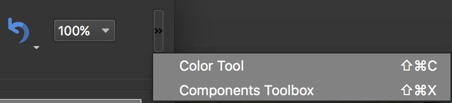
Color Tool – Use this tool to change colors of the entire skin or a selection of elements.
Generate Translations Template – Click to generate a translations template for the skin’s texts. Click and hold to choose Open Translations Template Folder, which opens the folder containing the generated template.
Components Toolbox – This is a collection of pre-defined and user-defined skin elements.