Creating and Using Components
Components are a group of skin elements that are saved as a single element in the Components Toolbox and can be reused.
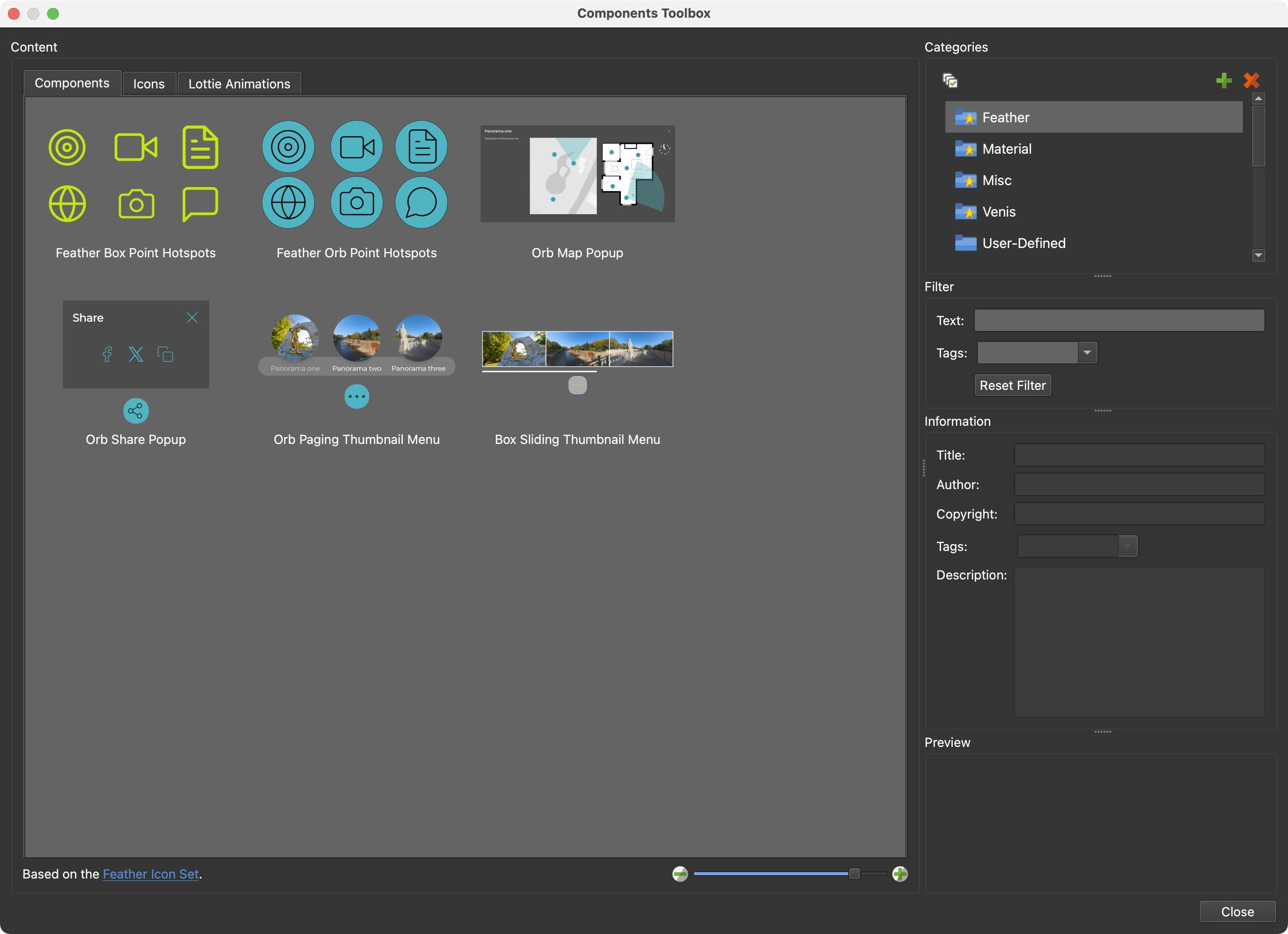
Understanding the Components Toolbox
The Components Toolbox is a feature in Pano2VR that allows you to store skin elements for reuse or sharing across different projects. It comes with built-in components that are free to use.
- Accessing Built-in Components: Open the Toolbox from the Toolbar or by choosing Tools > Components Toolbox.
- Component Information: Click on a component to see details, such as a description, tags, and a preview image.
- The built-in categories are organized in Categories, while the components you create can be added to the User Defined category, or to a new category you create.
- Components Toolbox Interface
Adding Components to a Skin
To add a component:
- Double-click or drag the component into the canvas.
- Alternatively, use the shortcut menu. Right-click and choose Add Component to Skin.
Example:
- Open a new skin.
- Add the Feather Box Point Hotspots component. This provides all the buttons and actions needed for all the point hotspot types. They will be arranged in a seemingly odd order. But because the hotspot template’s location in the skin arbitrary, there’s no need to rearrange them.
- Change the button’s background color to all buttons using the Color Tool. Make sure no element is selected and then open the Color Tool. Find the blue color and double-click the color in the right column to open the color picker to change the color.
- Save the skin and add it to your project. You now have a button set for all your hotspots.
Searching and Filtering Components
The Components Toolbox allows you to search and filter components by text or tags.
- Filter by Tags: Search using specific keywords (e.g., “feather”).
- Combine Filters: Narrow results by combining tags and text searches.
Example:
- Select all the built-in categories: click the first one, then Shift-click the last one.
- In the Text Filter, type
menu. A number of menus should appear. - Now refine the search using Tags. Find the tag
Categoriesand press Return (macOS) or Enter (Windows) to filter. Now you should have menus that support categories/submenus.
Creating and Saving Custom Components
- Right-click the desired element in the tree or a group of components and choose Create Component from Selection. To save the whole skin as a component, choose Edit > Create Component from Skin instead.
- Choose an existing Category, or click the plus button to create a new one.
- Enter a New Component Title, or choose Replace Component and the component to replace.
- Leave Open Components Toolbox After Creation selected to see the new component in the toolbox right away.
- Click OK to add it to the Components Toolbox.
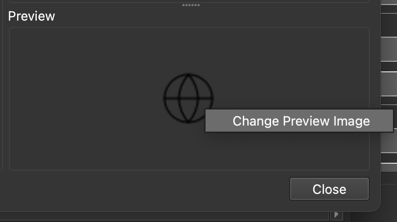
When the component is saved, it’ll take a screenshot of the skin’s Canvas or element for the preview image. You can change this preview image by right-clicking in the Preview and choosing Change Preview Image. Then navigate to the new image to set the preview image.
Sorting Components
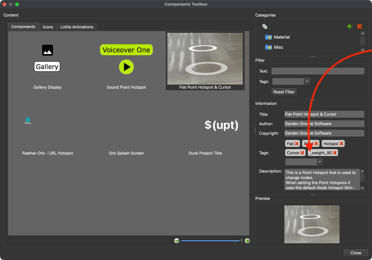
You can sort your components by adding tags with a weight number (for example:
_weight_10). Using a weighting system of sorting lets you determine which
components you’ll see at the top of the list. The higher the number, the higher
they are in the list. Anything given a weight tag is sorted higher; components
without one are sorted by file name. Weight tags are only shown while a single
user-defined category is selected.
- Select the component you’d like to sort.
- Give it the special weight tag with your desired value:
_weight_100. You’ll see the component jump to the top of the list. - Add weighting to another component. Decide if it should be higher or lower
than the one you just sorted. Maybe something like
_weight_90. This will place the component after the one the given the weight of 100 in the list.
Sharing Components
Sharing components with collaborators or the community:
Exporting:
- Right-click a user-defined category in the toolbox.
- Choose Open Category Folder in Finder (macOS) or Show Category Folder in Explorer (Windows).
- Share the component file. The file uses the extension,
ggskclikemap_popup_feather.ggskc. It’s a package file and can be shared to any other Pano2VR or Object2VR user.
Importing: Recipients double-click the GGSKC file, choose the category to copy it into (or New… to create one), and find it in their Components Toolbox. They can also drag the file onto the Components tab while a user-defined category is selected.