Scale an Element Based on Player Width
You can use logic blocks to create a responsive skin (where the skin elements scale to the player's width). This will require a logic block with multiple expressions.
Let’s scale a text box to twice its size when the player is wider than 1000 pixels and to 1.5 times its size when the player is wider than 600 pixels.
-
Open the Skin Editor.
-
Add a Text Box.
-
Go to the Appearance panel for the Text Box.
-
Click on the arrows next to Scaling. This will open the Logic Block Settings dialog.
-
Double-click in the table to add the first condition to the first expression (for when the player width is greater than 1000 pixels). The default Trigger will show up, which is exactly what we need, Player Width.
Set the Comparison to Greater Than (>). And set the Value to 1000.
Set the value to 200 for X and Y. Scaling values are percentages, so 200 is twice the element’s size.
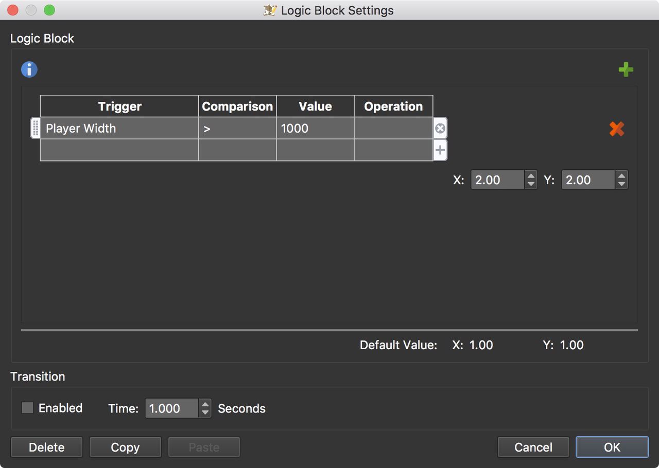
Condition one added So far, this explains if the player width is wider than 1000 pixels, then scale up the text box twice its size.
-
Add a second expression (for when the player width is greater than 600 pixels).
Click the green plus sign to add another table (expression). Add Player Width for the Trigger and set the Comparison to Greater Than (>). The value is 600.
Set the value to 150 for X and Y.
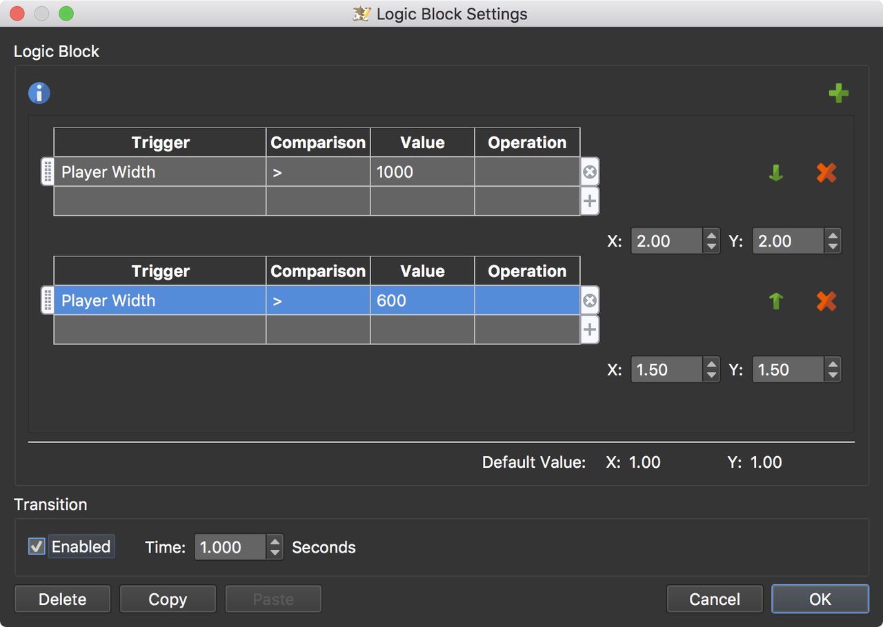
Condition two added This expression explains that if the width is greater than 600 pixels, then the text should be scaled up 1.5 times its size.
-
Select Enabled under Transition so it’s a smooth scale.
-
Save the skin.
With scaling you have to be a little careful that images don’t become pixelated. You can also use the Is Mobile trigger to create responsive skins. Go here to read how and download a sample project.