Polygon Hotspot Properties
Here you'll find the properties for the polygon hotspots which are found in the Properties panel once a hotspot is added or selected.
The hotspot properties are found in the Properties Panel and will appear once a hotspot is added or selected.
Other settings, like hiding the hotspots, are found in the Web Output Settings.
ID
The ID of the Hotspot which can be used in the Skin Editor.
Type
Choose what the hotspot will do. What you choose here will affect the Link Target URL below.
URL – Enter the website URL or file name of a node (i.e. http://www.example.com).
Tour Node– Choose a node from the menu to link to other nodes in a tour.
- Skin Proxy – This type of polygon hotspot has no function, but rather only responds to Hotspot Proxy IDs added to the skin.
Title
Add the title of the hotspot here. This title will be visible (e.g. tooltip) when the mouse pointer hovers over the hotspot.
Description
Enter a description of the hotspot here.
Link Target URL
The options here will depend on the Type chosen.
-
URL – enter the web or path URL to the node.
-
Tour Node – choose a node from the menu. Click the green arrow to open the linked node. Alternatively, drag in a tour node from the Tour Browser on to the polygon hotspot.
Target
Add a target to specify where to open the website (or panorama).
If Tour Node is selected as Type, click the bullseye icon to orient the opening view of the next panorama.
★ Tip: You can also enter the Pan, Tilt, and Field of View information in the Target field. This will override the default view settings in viewing parameters of the target node. Enter the parameters separated by slashes (/): 324.0/-3.5/70.0.
Color
Choose the color of the polygon hotspot.
-
Use Default – Select to use the default colors defined in the Hotspots panel in the web output properties.
-
Background and Border – Click the colors to open a color palette and define new colors.
✭ The color changes are not visible in the Viewer.
Custom Properties
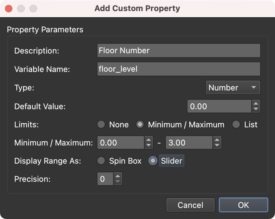
If your project needs more properties, you can add them as custom properties. Click the plus button to add a new custom property. A dialog will appear where you can define the parameters:

A custom property is a variable that can be used in the skin. For Type, choose from Text, Number, or True/False.
For each type, you can control how the variable is displayed by setting Limits:
- None – No limits. For Text, this gives a single text field. For Numbers, an editable number chooser. For True/False, a dropdown list.
- Maximum/Minimum – Set a range for number variables. Enter the minimum and maximum values, and choose to display the range as a number chooser (Spin Box) or as a Slider. Use Precision to set the number of decimal places.
- List – Create a list of options as key-value pairs. For example, Key =
1, Value =Hello; Key =2, Value =World. You can display the list as a Dropdown (combo box), a Color Combo Box (use Hex color codes for the Key), or as radio buttons (multiple choice).

When you open a skin from the Web Output, any custom properties created here will be added as variables in the skin properties.

You can also create a custom property from an existing skin variable. Long press the plus button to create a custom property from a skin variable.

Right-click the label of a custom property to edit or delete the property.
Learn how to add custom properties.
