A controller is a collection of buttons within the skin that allow the user to control (rotate, zoom, move left, etc.) the object.
For a custom controller, you can build your own buttons or use some of the ones provided by fellow users.
Build a custom controller
- In the toolbar, select Button.
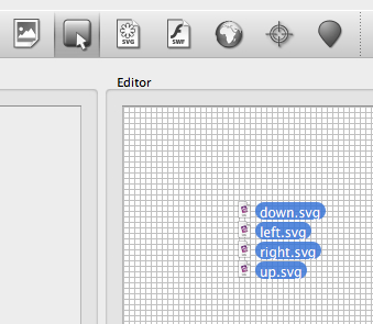
- Drag the button images onto the Editor Canvas.
◊ NOTE: When dropping multiple images at the same time onto the canvas, they will be stacked on top of one another. Click in the canvas to unselect any button, and then click on each image to move it. - Prepare the canvas (optional): Change the Grid size:
- Deselect any elements in the tree.
- In the Properties section, Canvas panel, adjust the Grid size to 10 pixels.
- Prepare the canvas (optional): Set the Zoom to 200%.
- Next, move the buttons into an arrangement in the canvas.
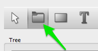
◊ TIP: Use snapping to help align the elements. Go to View > Snap to Guides. - Once they are arranged, you might find it handy to be able to move them all at once. This is the Container‘s job. Draw a Container around all the buttons:
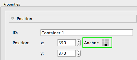
- Anchor the Container to the bottom center of the window (or wherever you plan for your buttons to be positioned on the skin):
- Add a second button state (or more).
- Add the appropriate action to each button image:
- Select a button in the Tree or Editor.
- In the Properties section, click on Actions.
- Double-click or click on the plus to the right of the table, to open the Action Settings.
- For a Tilt Down button, Choose Mouse Click for the Source and Tilt Down for the Action. Click, OK, when finished.
- Repeat this process for each button.
- Test the skin with the Live Preview.
- Finally, click Close and save the skin (to the Skins Directory).
Button States
Buttons can have different states that animate a button (or make it obvious that it is clickable). In general, the normal state is how the button looks without any interaction. The Mouse Over state is how the button will look when the mouse hovers over it. The Selected state is what the button looks like when it has been selected.
To have all of these states, you will need 3 versions of the button that vary slightly from each other (or they could be completely different…it’s your design!)
Each state is represented by a different color so you know in which state you are working:
- Normal: Red
- Mouse Over: Blue
- Selected: Green
The default state is Normal; buttons are automatically assigned the Normal state on import.
To add another state to a button:
- Choose which state you would like to work in from the State menu in the Toolbar.
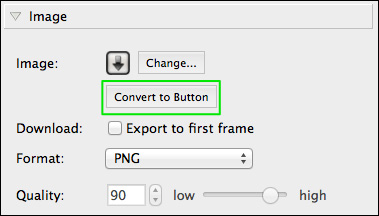
◊ TIP: Be sure the image is a button, to see the states. If the image is not a button, you can convert it in the Image panel. - Add the additional state by doing one one of the following:
- Drag the button images intended for the specified state onto the already existing button images in the Editor.
- In the Image panel in the Properties, select, Change…, and choose the button image.
The new state will be added to the Tree:
Learn more
See also
The Interface (Skin Editor)
Using the Skin Editor
| Previous: Add a Clickable Logo | Next: Build a Simple Loading Bar |


